
Bootstrap is a popular design CSS grid framework. A CSS grid framework consists of a specific number of columns and rows. You can quickly define different layouts using a grid framework. It helps you to quickly build the layout of your web application.
What if you want something really simple? You just want a simple grid and create the rest of the design yourself. Do you choose a pre-made CSS Grid framework or build your own? It depends on your preferences and project needs. If you need to complete your project quickly, choose a pre-made framework. If not, you may choose to build your own to use in later projects.
Simple and Responsive Grid Frameworks
Try out one of the following simple and responsive pre-made grid frameworks:
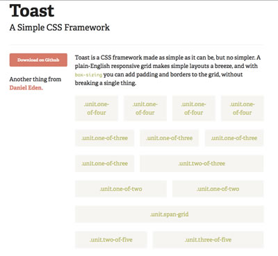
Toast – Simple CSS Grid
If these don’t work for you, a quick Google search provides you with more options to try.
Build your own framework
Why build your own framework? Most developers like working with code that they understand and have control over. With a pre-made framework, you have to deal with the choices that the developer made to get their framework working. You may not have the time or patience to attempt to fit another’s framework to your project.
To build your own framework, you need to:
- Determine how many columns 9, 12 or 16? The standard number of columns is 12. 12 makes it simple.
- Sketch out a design.
- Create the structure for the grid framework. You don’t have to make it complicated. The best grids are simple.
- Test out the HTML and CSS for the grid framework.
- Make it flexible and responsive. You want your grid to work with your future projects: mobile and beyond.
Building your own framework doesn’t have to be an overwhelming challenge. Check out how Joe Richardson built a responsive grid system.
Are you going to build your own?