Microcopy Tools and Tips

As a developer, you may overlook the tiniest bits of text on your app or website. The copy on your buttons, labels, tooltips and error messages can have the biggest impact. It can help your users to understand how to use your app or website.

Microcopy Tools and Tips
Photo by Med Badr Chemmaoui on Unsplash

Picking out the right words can help people to keep using your website or choose another. Use these tools and tips to help improve your microcopy.

1. Keep it casual

You want to convey a tone that is friendly and relaxed. Keep it simple and conversational. Address your users by using “you” and “your”.

2. Use simple, everyday words

Pick out words that talk to your users. Use the same language that they do. Avoid using complex jargon and words. Keep it short and to the point.

3. Be helpful

You want your users to keep using your app or website. Microcopy should help guide them. Pick words that help them to understand what is going to happen. Words like download, buy now, learn more or get more information.

Depending on what you want your users to do, you’ll want to confirm that they completed an action. Or shows an error message if it fails. You want to provide feedback to the user that helps them complete their tasks.

4. Use a microcopy tool

You can use an AI writing assistant or a microcopy collection to help you write better.

5. Test your copy

Not all copy resonates with your users. You may need to try different words before you find what works with your users.

Challenge your writing skills

Take the Daily UX Writing Challenge to practice writing better microcopy.

Learn more tips on improving your user experience with UX Writing.

Making an Advice Generator

Have you tried a coding challenge? Coding challenges allow you to stretch you programming and design skills. You have your choice of places to find coding challenges.

Making an Advice Generator
Image by Dean Moriarty from Pixabay

You can pick coding challenges that ask you to build components or a simple app. Some of the challenges include working with an API.

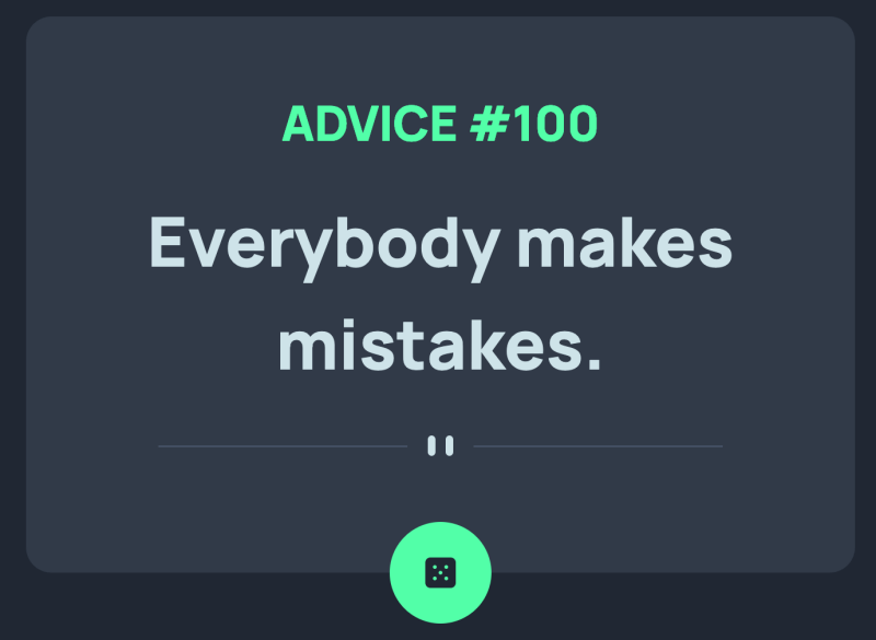
Advice Generator

The Advice Generator coding challenge on Frontend Mentor has you working with an API. This API provides you with data for displaying advice on a web page.

Screenshot of Advice Generator with Advice #100: Everybody makes mistakes.

How I Built It

I created this app using HTML, CSS and JavaScript. For CSS, I started with Bootstrap to help structure the design. Then, I used FlexBox to manage the layout.

Fetching Data

I used the JavaScript Fetch API to fetch the data from the Advice Slip JSON API and display it on a web page. By default, it picks a piece of advice and displays it. If you want to get another piece of advice, you need to click the dice icon. This icon button retrieves a random piece of advice.

If you don’t use the cache option of no-cache, you get the small piece of advice. When you call the API which returns a random piece of advice, it doesn’t display on the web page. It is caching the data. When you use the no-cache option, fetch retrieves a random piece of advice.

Design Challenges

The layout required centering the advice box and the dice icon for the button. To handle this, I used FlexBox to center the box and to align the button on top of the bottom of the box. You need to use a combination of absolute positioning and FlexBox to get the dice to appear where you want it.

The advice box needs to be flexible. It has to expand and contract depending on the size of the advice. FlexBox makes this easier.

Other Coding Challenges

Managing User Experience Debit

What is UX Debt? Like technical debt, UX debt piles up over time. Each design decision that you make can affect the user experience. Do you create a great user experience or ship your product? If you’re on a tight deadline, shipping wins.

Managing User Experience Debt
Photo by Sarah Pflug from Burst

What are the types of UX Debt?

There are two types of UX Debt — Intentional and Unintentional. Intentional debt occurs when you don’t have time or the resources to build your product right. Unintentional debt occurs over time. Design decisions that worked yesterday may not work today. Your users have changed and your UI hasn’t.

How do you manage it?

User Experience debt becomes a problem when you ignore it. Like technical debt, you need to manage how you handle it.

1. Determine where UX debt exists.

You need to figure out what issues you need to fix. Common places to look for problems are:

  • User Interface. Your buttons, links and visual styles may be hard to understand.
  • Content or copy. Check your written text, labels and headlines. They may be using confusing or hard to understand language.
  • Interaction Design. Is it easy to move from one page to the next?
  • Consistency. Does your UI look the same? Your elements should look and behave the same way.

How do you identify it?

  • Ask your users.
  • Use and analyze your analytics.
  • Perform regular user testing.

2. Focus on fixing debt

Not all issues are the same. Some need to be fixed right way. Others can wait until you have time. Rank the issues so you know which ones need to be handled first.

3. Build time into your schedule

Plan to tackle the UX issues that you have identified. If you don’t add them to your development schedule, you’ll forget to address them.

Learn more about UX Debt

7 Tips to Make Your Website More Engaging

How do you make your website more engaging? A website that engages people means they spend more time on it. They read, search, interact or buy products from you. People come back for more and share with others.

7 Tips to Make Your Website More Engaging
Photo by Sarah Pflug from Burst

Use these steps to help make your website more engaging.

1. Mix up the layout

Are you using the same layout for every page? If you are, you may want to use different designs. One design for your blog and another one for your store. By mixing it up, your visitors don’t feel like they are visiting the same page over and over again.

2. Use White Space

White Space or “negative space” is the space that surrounds elements. Add extra space between different elements. It helps users scan your design. White Space can increase readability and legibility. Too much stuff on a page can make it feel cluttered. It helps to guide users and gives the content breathing room.

3. Choose a simple color palette

How many colors are you using? Too many colors or clashing colors can distract your users. It makes your site hard to use. Use these 7 Rules for Choosing A Website Color Scheme and How to Pick Colors for Better Readability.

4. Pick simple and easy to read fonts

Fonts have personality. Some are simple. Others are very decorative. Some fonts work better for print. Pick fonts that work well with your brand. Make sure it works well on mobile devices.

5. Make your site easy to navigate

If your users can’t find what they are looking for, they’ll leave your website. Your navigation structure helps people to learn how to use your website. It describes how web pages are organized and connected to one another. By combining different types of web navigation, you can make your site easier to navigate. Learn how to improve your website with navigation.

6. Use clear Call To Actions

Make your Call To Action stand out from the rest of the page. Use copy that is clear and distinct. You want your visitors to understand what you want them to do.

7. Make your content easy to read

Most people scan your content before reading it. They are deciding if they should spend the time to read. Use the following techniques to improve readability of your content:

  • Consider Accessible Font Sizing. Not all font sizes are readable to everyone. You want the user to choose the font size that works for them.
  • Use headings, bullet points, short paragraphs and white space to break up the copy. You don’t want your visitors to be overwhelmed by a wall of text.
  • Use a mix of short and longer paragraphs. You can use paragraphs that are one sentence long.

By using these techniques, you can improve how your visitors respond to your website.

Filling Up Empty States

What are empty states? These are spaces on your app or web page which can be empty or blank. Screens or panels where no data or content displays. Why? Your users haven’t entered anything or data can’t be displayed.

empty room with wall wall and plant
Photo by: Darkmoon_Art on Pixabay

You might be familiar with empty states. Some typical scenarios are:

  • When a search returns no results
  • You have downloaded a new app and haven’t entered any data or content
  • An error has occurred
  • When you have deleted all of your data

What can you do? You could leave it empty. Or display information to the user. What kind of information would you put here? You want to use this space to communicate the app’s status. Teach new users how to get started or discover new features.

Communicate status to the user

When you use an app, sometimes you may wonder if it is working. This can occur when you run a search and get no results back. Or an error has occurred.

Silver Sneaker Location Search Error

Teach users how to get started

A blank or empty space can be intimidating to first time users. Use the space to teach your users what to do next, you help them to get started using your BMI Setup Guide

Starter Content

Show your users how to create new content with examples. Use starter content to give them an idea on how to fill the space. If you sharing photos, you may put a couple of photos in to demonstrate how that works.

Todo App with Starter Content

Summary

Don’t leave your users guessing what the app is doing. By using empty states, you help your users to get started using your app quickly. Learn how it works and be confident they can get what they want to do done. Refer to Designing Empty Spaces in Complex Applications to learn more.