Filling Up Empty States

What are empty states? These are spaces on your app or web page which can be empty or blank. Screens or panels where no data or content displays. Why? Your users haven’t entered anything or data can’t be displayed.

empty room with wall wall and plant
Photo by: Darkmoon_Art on Pixabay

You might be familiar with empty states. Some typical scenarios are:

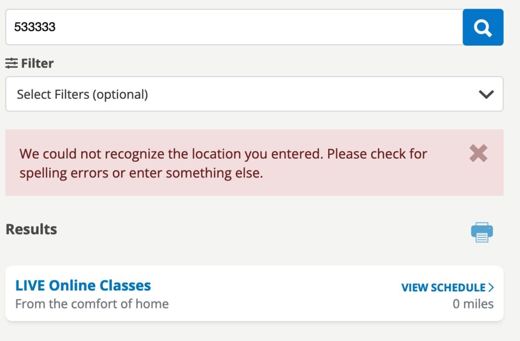
  • When a search returns no results
  • You have downloaded a new app and haven’t entered any data or content
  • An error has occurred
  • When you have deleted all of your data

What can you do? You could leave it empty. Or display information to the user. What kind of information would you put here? You want to use this space to communicate the app’s status. Teach new users how to get started or discover new features.

Communicate status to the user

When you use an app, sometimes you may wonder if it is working. This can occur when you run a search and get no results back. Or an error has occurred.

Silver Sneaker Location Search Error

Teach users how to get started

A blank or empty space can be intimidating to first time users. Use the space to teach your users what to do next, you help them to get started using your
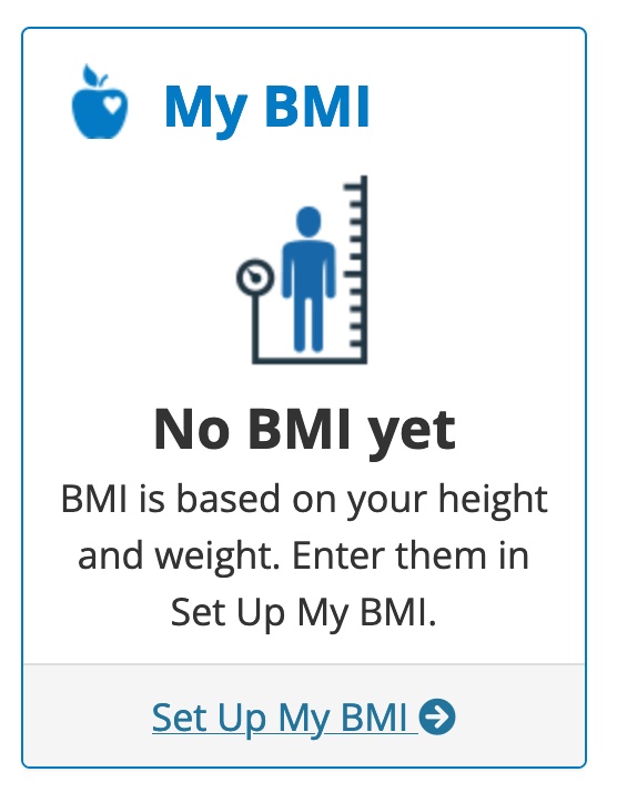
 BMI Setup Guide

Starter Content

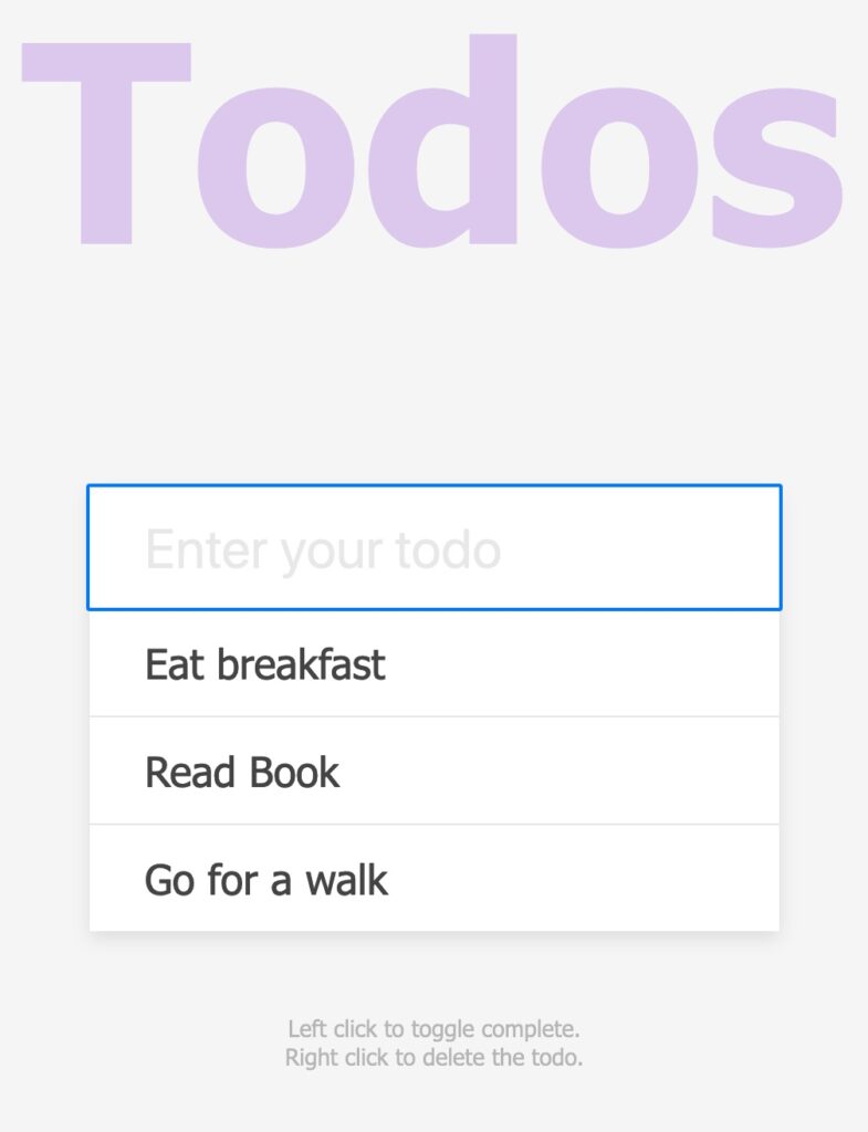
Show your users how to create new content with examples. Use starter content to give them an idea on how to fill the space. If you sharing photos, you may put a couple of photos in to demonstrate how that works.

Todo App with Starter Content

Summary

Don’t leave your users guessing what the app is doing. By using empty states, you help your users to get started using your app quickly. Learn how it works and be confident they can get what they want to do done. Refer to Designing Empty Spaces in Complex Applications to learn more.

Accessibility Resources and Tools for Developers

What is accessibility? It is making your website as usable for as many people as possible. You want to make sure it works on different devices and slow networks. People with changing abilities due to aging, physical issues or situations.

Accessiblity Resources and Tools for Developers
Photo by Sarah Pflug from Burst

To make your website or app usable to as many people as possible, you’ll need to use different accessiblity resources and tools.

Design

Color is one tool that can make or break a design. Choosing the right colors can be hard. Radix Colors helps you to select colors to design beautiful and usable websites and apps.

When you need to check if two colors and the font work well with each, you can use Accessible Colors. Not sure how to choose the right colors? Stephanie Walter has a list of resources, tools and tips on color accessibility.

Many web development teams use style guides or a design system. These tools help to make your website or apps consistent. A11Y Style Guide gives you tips, tools and WCAG guidelines for developing. It includes a pattern library focused on accessibility. You can use their guide as a reference for your own style guide.

Development

You want to build things that people want to use. What do you need to know? You need to understand how people use websites and what you need to know to optimize it. The Accessibility Developer Guide explains what to look for and how to fix it. Many problems can be fixed by looking at how you write HTML.

Testing

As a developer, you need to test your code. You also want to test how use to easy your UI is as well. There are different tools to choose when you test the accessibility of your website or app. Here are a couple to start with:

  • Your keyboard. Many blind users navigate a website using their keyboard. Use the WebAim guide to Keyboard Accessibility.
  • WAVE – a free web accessibility checker
  • Lighthouse – an open source tool for helping you improve the quality of your website.

Where to find more accessiblity resources and tools

Use this short list to learn more about how you can add accessibility to your workflow.

Layouts with FlexBox

You can use a CSS library to design a large scale website. What do you do if your needs are simpler? A CSS library like Bootstrap may be too much for your project. Smaller projects may need a simple CSS solution.

Layouts with FlexBox
Image by Gerd Altmann from Pixabay

FlexBox or flexible box can be for design small-scale layouts or applications. For larger projects, you can use it with your favorite CSS library. FlexBox provides you with tools to create layouts that grow and shrink as you need them to.

When would you use FlexBox for layout?

If you are creating navigation menus, web forms, media items or card layouts. Even simple basic grid layouts can be done with FlexBox.

You can use FlexBox to create different kinds of grids. Grids like 3X3, Masonry or Alternating rows. Tobia Sahlin shows you how to build these basic layouts.

What problems can you solve with it?

You can tackle some problems with FlexBox that were difficult using CSS alone. Problems like Vertical Center, Sticky Footers, Input Add-ons and more. Solved By FlexBox shows you 6 different UI solutions that you can do. It includes solutions like vertical centering.

Where do I learn more?

Why use HTML and CSS over JavaScript?

When you build for the web, you have to make many different choices. What am I going to build? What tools are I going to use? The number of tools, frameworks and libraries available can be overwhelming.

Why use HTML and CSS Over JavaScript
Photo by Nicole De Khors from Burst

JavaScript is no exception. You have a wide variety of JavaScript frameworks or libraries to choice from. Should you use these technologies for every project? HTML and CSS can now do many things that you once needed JavaScript to do.

What is the Lean Web?

The Lean Web is a set of simple web development principles. Best practices for building the web with HTML, CSS and JavaScript. Chris Ferdinandi who wrote the Lean Web encourages you to embrace the web as a platform. To let the browser to do what it does best.

Chris gave a talk on Lean Web at WordCamp LA 2020.


The Three Lean Web Principles

Principle 1. Embrace the Platform
Use HTML over JS, CSS over JS and use the browser for what it is good at. Does that mean you shouldn’t use new tools and technologies? No. You need to decide when you should use them and why.

Principle 2. Small & Modular
Look for small, focused tools that do one thing really well. Use APIs, native browser methods or alternative tools lie Svelte or Preact. Use utility-first CSS to prevent redundancy in your stylesheets.

Principle 3. The Web is for Everyone
Not all browsers support native features. You can use a polyfill to replicate the feature. As developers, we make choices that can break the web for some people. Chris suggest using the A11Y Project to make sure that everyone who wants to use your web applications can.

Summary

You don’t want to avoid using new tools, frameworks and techniques in favor of old ways of doing things. When you are building any project, you have to make choices on what to use. Sometimes, HTML and CSS is the better choice.

How do you reduce website bloat?

Why is my website slow? It is a common question developers, designers, bloggers and even your visitors ask. No website is immune from having speed issues.

How Do You Reduce Website Bloat
Photo by Farzad Nazifi on Unsplash

What causes website bloat?

How you designed and built the site affects its speed. Things like images, videos, CSS and code can impact your site. Even your server can affect how the site performs.

What can you do to speed up your site?

1. Optimize your images

You may be using images created in file formats that aren’t designed for the web. They may be large in file size as well. You can use an optimize tool to shrink the file size down without noticeable loss in quality. When you optimize an image, it loads faster on your site.

2. Get rid of unnecessary images

Check your web server for unused images. Unused images can affect user experience and performance of your site. If you aren’t using these images, delete them off your server. WordPress users can clean up their images using plugins or manually. If you have Windows, you can use Powershell to find and remove used images.

3. Optimize your videos and other files

Large files can slow a web site down. Files like videos or PDFs get quite large. You can optimize them before uploading. For PDFS, you can use Adobe Acrobot Pro’s PDF Optimizer to make them faster for the web. With videos, you can use a video hosting service like Vimeo or YouTube to host your videos. Then, you can embed them on your page.

4. Optimize your CSS

CSS files can get large and unruly after a while. Optimizing and managing them can be a challenge. It can be hard to find unused styles. You can use a tool like Helium CSS to find them. By getting rid of unused styles, you can reduce the size of your CSS.
Some of your styles are used more often than others. Print styles are used when a page is printed. You may want to separate them into their own file. With frequently used CSS, you may want to consider using inline styles instead. Before uploading your CSS, you can use a minifier to reduce the amount of whitespace it uses.

5. Check your code for speed issues

Are you using old code? If you are, you may need to rewrite, refactor or even replace it. Look at older code and decide if you need to keep it. If not, remove it.

6. Review the content of your page.

You may have too many items on your page. Do you have old or outdated content? If so, you can remove them. Review the rest of the items on the page to see if you can remove some content and still achieve the same goals of the page.

Summary

Preventing website bloat can be a full time job. By changing your development process to include optimization. You can prevent it from getting slow.