What can you do with FlexBox?

FlexBox is a flexible box layout model for the web. This model gives you a way to automatically rearrange responsive elements. They can adjust in size either increasing or decreasing depending on the device size. FlexBox can be a great addition to your CSS toolbox. It helps you to write adjustable and adaptive CSS.

What can you do with flexbox
Image by Magic Creative from Pixabay

How do I get started?

You can start by reading guides on how to use FlexBox. The Mozilla Developer Network has a guide on the Basic Concepts of Flexbox. Or try CSS-Tricks’ A guide to FlexBox.

If you need to fix a problem right away, you can use Solved By Flexbox to find a solution to common problems.

3 different ways to use it in your projects

1. Centering items on a page

Without FlexBox, it can be challenging to center items like text or images on a page. Sometimes, you have to resort to hacks to get it to look the way you want. FlexBox makes it so much easier. Use these tips to center items either horizontally or vertically.

2. Photogallery

You want to create a photo gallery that is responsive. Use this photo gallery to make one that looks like Flickr or Google Photos.

3. Responsive Tables

Tables are not responsive. You can make them be by using a little bit of FlexBox without having to redesign them.

Need more?

Flexbox Patterns has solutions to problems that you can use. It demonstrates the solution and shows you how to create the flexible box layout yourself.

Completing a Pricing Plan Coding Challenge

I found Frontend Mentor where you can improve your front-end coding skills by building real projects. You can pick a challenge that appeals to you. Then, download the design documents, images and other assets that you need.

Pricing Plan Coding Challenge

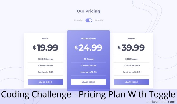
Pricing Component With Toggle

The challenge I chose was the pricing component with toggle. It has three options: Basic, Professional and Master. You have to use a toggle switch to show the prices for Annually or Monthly.

How I Built It

I built it using HTML, Bootstrap and JavaScript. With Bootstrap, I had to override some of its styles to get rid of the column margin and create custom styles for the button.

I wrote JavaScript that watches for when the toggle is selected. When you open the page, it defaults to monthly pricing. If you select Annually, you see the Annual prices. When you select Monthly, it switches back to Monthly prices.

What I Learned

The style guide defined colors in HSL and included a linear gradient. The linear-gradient is a CSS function that allows you to create a transition between two or more colors along a straight line. You can choose the direction or angle of the transition. For two of the buttons and toggle, the gradient moves from left to right. The professional plan card moves from top to bottom.

I used two structural pseudo-classes in CSS to create the design. The :first-of-type and :last-of-type selectors allow you to target the first and last occurrence of an element in a container.

Bootstrap has a toggle switch available. It was not customizable with CSS. You have to compile custom Bootstrap in order to change how it looks. I found CSS toggle solution that works like the design. I modified it to work with my CSS.

Frontend Mentor asks developers to post their solutions to their site. If you get stuck on a project, you can look at their solution to see how they approached it.

You can see my version of the pricing plan with toggle.

Creating notification bar for emergencies and announcements

What is a notification bar?

A notification bar is a horizontal bar that appears at the top or bottom of your website. You can display emergency messages or announcements to your visitors. Messages about closings, updates, news or sales offers.

Create a Notification Bar for Website
Image by Gerd Altmann from Pixabay

How can you add a notification bar to your website?

It depends on how you want to do it. If you like to write code, you can make it yourself with HTML and CSS. If not, you can add a plugin or a third-party tool to your website.

1. Make your own

Are you using Bootstrap? Bootstrap has alerts. You can create your own bar with Bootstrap alerts. If you are using a different CSS framework, you can write your own.

See the Pen
Alert Animation (feat. Material Icons by Google)
by Ryan Young (@rcyou)
on CodePen.

2. Use a plugin to display message on your WordPress site

If you have a WordPress website, you may not want to edit your theme. Instead, you can add a plugin. WPBeginner explains how to use the plugins Optin Monster or Simple Notices for displaying important messages on your blog. If you are already using the plugin Advanced Custom Fields, you create custom emergency messages with it.

3. Use a third-party tool

You can choose to use a third-party tool like Getsitecontrol. They offer different ways of creating announcement bars for your website. You can add a sticky announcement bar or a slide-in banner that appears from the side.

Emergencies can occur at any time. You need to have a way of communicating with your customers and staff. Whether you make your own or use a tool, you can ensure that everyone can keep up to date on what is happening.

How to Pick Colors for Better Readability

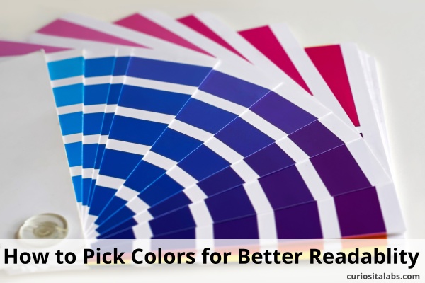
Have you thought about the readability of your website? The colors you choose can impact how readable people find your website to be. If people can’t read your website, they may become frustrated and go somewhere else. How do you choose the best colors? By testing your color combinations for contrast.

How to Pick Colors For Better Readability
Image by vixrealitum from Pixabay

What is color contrast?

Contrasting colors or complementary colors are from different segments of the color wheel. For example, red is a warm color and blue is a cool color. They appear on different segments of the color wheel which makes them contrasting colors.

By using contrasting colors in web design, you provide enough contrast between content and background so that your website is readable to as many people as possible. You want to make sure your buttons, body text, logos and other content has the right amount of contrast.

1. Choose a color palette

For some projects, you may have a pre-existing color palette to work with. If you don’t, use a tool like Material Palette or Colormind to choose a color palette. Or choose from these 90 Accessible Color Classes to build your palette.

2. Find a color contrast analyzer

You can find many color contrast testing tools on the web. Pick one that works for you. Here are a few to test out:

3. Pick your primary colors

Is your theme light or dark? You want to pick colors that work best with the types of colors for your theme.

4. Choose colors for the body text

You may need more than one color for the body text. Each color can be for a specific task like headers, body and sub-headers.

Buttons and links tell users that you want them to do something. You want to pick colors that draw attention to them and easy to read.

6. Establish color combinations

You may need to add error messages, calls to action or other areas for users to pay attention to.

7. Check your results

After you build your website, use the accessibility checker in the browser for any additional issues. If you find problems, use a contract analyzer and retest.

Learn more about readable colors

How to keep improving your UX Design skills as a developer?

Not creative? It takes creativity to solve programming problems. Design is about solving problems, not making things pretty. You can learn UX Design. Design is a learned skill. You can get better at it.

Improve Your UX Skills
Photo by Daria Nepriakhina from Pixabay

How do you keep improving your skills? The same way you improve your programming skills. You learn about design principles, practices and tools. Then, you build something.

Understand design principles

Design principles help you to make websites and apps that are aesthetically pleasing, easy to use and behave the way the user expects them to.

Learn and Use UX Design Tools

Developers like their tools. You can find design tools that help you do tasks like wireframing, prototyping, animations and more. Which tools do you use? That depends on your needs and preferences. Here is a short list to help you find the tools that may work for you:

Take a UX Design Course

A UX Design Course can give guidance on best practices, basic principles and techniques for creating software that people love to use.

Read up on UX and Design

Keep up to date on changes in UX and Design by reading books and blogs.

Blogs

Books

Build Something

Take an app that you built previously and redesign it with what you have learned. By redesigning it, you can see what works better.

Keep experimenting. You can get better by practicing.