Choosing fonts for your next project

Choosing fonts for your project can be a challenge. How do you pick fonts that work? The fonts that you choose can either help or distract your users. You want to pick fonts that are easy to read and fit the personality or mood you want to convey.
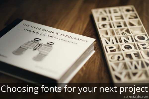
Choosing fonts for your next project
Photo by Alexander Andrews on Unsplash

Where do you start?

Pick fonts that match the purpose of your design
Whether you are creating a blog, tutorial, app or business website, you need to pick fonts that match the mood or personality of the project. Fonts can have distinct personalities or moods — casual, serious, playful or elegant.

Decide on a visual hierarchy

Fonts help you to design a typographic hierarchy. You decide how the fonts work together. The three levels we need to consider are primary, secondary and tertiary. The primary level is your headlines. Secondary is used for subheads, captions and pull quotes. The tertiary level is your main body text. These levels help users to scan quickly and focus on the information that they need.

Choose fonts that work with your project

No matter what type of project you are making different fonts work better than others. Fancy and decorative fonts may be a better choice on a blog than your business website.

Create contrast

Pick fonts that complement each other. Mix style, weight, size, spacing and color to achieve the desired effect. For example, pari a bold, chunky font with a tall, thin one.

Limit the number of fonts used

Try keeping the number of fonts to 2 or 3. If you design needs more, add one font at a time.

Use a font generator

A font generators can help you to pick out fonts or experiment with new ones.

Practice

Build sample pages or apps to test out different fonts to see how they work. Keep experimenting and reading blogs for suggestions on font combinations.

Read more

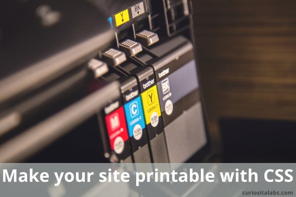
Make your site printable with CSS

Do your web pages look as good on paper as in your browser? When you are developing your website, you create it to look good on different devices. Then, you print it out and see how terrible it looks on paper. It prints everything out.

Make your site printable with css
Image by tookapic from Pixabay

What can you do to make it look good on paper too? You have to design for print as well. By using CSS, you can change your design to work on paper, too. The easy way is to add an additional media query for print to your CSS. Or you may want to separate it out into its own file.

What you need to create printable CSS?

  • Decide what elements need to be printed
  • Change your print styles to work with the printer
  • Adjust your design to be printable

Decide what needs to be printed

Websites have navigation bars, footers and other design elements that are necessary to use your site. When you are printing, you want only the content not the extras. To make a page printable, you need to decide which elements don’t have to be printed.

Change your print styles to work with the printer

When you print your page, you want it to fit on a page and not cut off important content in strange spots. If your page includes videos or iframes, you want to prevent them from printing as well. Sitepoint shows you how to create the perfect print stylesheet.

Adjust your design to be printable

What do you change? First, look at the font size. Is it too big? You may want to consider changing the size to fit better on paper. Next, are you using background colors on certain elements? You could change them to a different color or hide them.

Are you using a CSS Framework? The framework my impact how it looks on paper. For example, Bootstrap 3’s col-sm-* turns into a single column on paper. You want to change their settings so that the columns work they way you want on paper. Donnie Ray Jones explains how to fix Bootstrap 3 for printing.

By adding printable CSS to your site, you control how your page prints on paper. Your users will be happy it doesn’t print so many extra pages. It is easy to add to your website after you have finished developing.

4 Ways to Make Your Web Design Simple

What is simplicity? According to Merriam-Webster Dictionary, simplicity is the state of being simple, uncomplicated or uncompounded. A simple web design is uncomplicated. Minimalist design style is related to simple. It has only the necessary elements for functionality. A minimalist design can be simple, but a simple design is not minimalist.

4 Ways to make your web design simple
Image by Ambady Sasi from Pixabay

Is your website complicated or complex?

What makes it complex?

  • Too much content
  • Unnecessary design elements
  • It’s slow to load and hard to use

Why do you want your design to be simple?

A simple website is easy to navigate and use. It has the right number of design elements. A simple website loads faster and helps guide your customer to do what they want. It has content that is readable and scannable.

What can you do to make it simple?

Look at your content and ask is it necessary?
If not, remove it. If its, consider rewriting it. Use bullet points, shorter paragraphs and headings to break the text up. You don’t want to overwhelm people with a sea of text.

Review your site for extra design elements
Do you have colors, illustrations and photos that serve as decorations? If so, consider removing anything that is unnecessary.

Check for ease of use

  • Is your navigation bar complicated? Too many options can make it hard to use.
  • Do they need to go to multiple pages before getting all of the information that they need? Too many pages can make a simple design hard to use.
  • Are your forms easy to use? Complicated forms can make your visitors leave your website.

Look for items that slow your site down
Your photos, CSS, CMS and additional code can slow your website down. People won’t use your site if it is really slow. Use tools to compress and optimize your photos and CSS. Make sure your CMS is updated to the latest version. If you use any third party or custom code to extend your website, check if they are causing speed issues. See if you can get rid of the slow ones.

Simplicity is not a design style. Keeping your web design simple is hard. Websites change and evolve over time. You have to continually work to keep the design simple.

5 Strategies for Mobile First Design

Do you develop your website with a mobile responsive or mobile first design strategy? How do I know which one that I am using? Mobile responsive uses CSS to adjust the design to look good when viewed on different devices. Your design may have started out for desktop and updated to work on mobile. Mobile first focuses on designing for mobile users and their devices first. With the numbers of people who use the Internet through a smartphone or table, you want to make sure that your site is usable and fast for them.

Photo by Matthew Henry from Burst

What mobile strategies can you use?

1. Keep your content short
Use writing tools like Grammarly and Hemingway to help you write better and keep it short.

2. Keep your site simple
Review your website. Look at the number of pages and links in your navigation bar. You may have too many. Consider getting rid of old and unnecessary pages and links. Are your pages cluttered? Do they have too much information crammed onto them? Use white space to add breathing room between different pieces of information. Can you reduce the number of columns you use to two or one? On mobile, you want to limit the number of columns used. Two or less is recommended.

3. Use Mobile First Design practices
Use white space, vivid colors, bold shapes and strong typographic elements in your design. Do you need to use photos? You can use a mix of stock and real photos to create a unique brand. Remember to optimize the photos for the web. Photos with large file sizes can slow your site down.

4. Make your site fast
Your site needs to load fast. People will leave a website with performance issues. On mobile, it is even more important. What can you do to speed it up?

5. Test and get feedback
How do you test your website without access to different devices and users? You have to test as best you can.

  • Test your website with an online testing tool to see how it works on different devices.
  • Test on many real devices as possible.
  • Ask your co-workers or staff if they like how the website works.

Whether your visitors use a phone, tablet or desktop, you want to make the experience a good one. By designing for mobile first, you can make design decisions that help create a good user experience.

Making a Dark Mode For Your Website

Do you use dark themes or dark mode in your text editor? You can offer website visitors a choice of dark or light modes. Some people prefer using the dark mode because it is easier on their eyes.

Making a Dark Mode For Your Website
Image by PublicDomainPictures from Pixabay

What do you need to create a dark mode?

The only tools you need are HTML, CSS and JavaScript. You can use a button to allow your visitors to select between modes or use media queries that check their operating system for their preference.

Toggle example

Ananay Negoi uses CSS Variables and a button to toggle between light and dark mode. She demonstrates how to build the Dark-Light mode switch.

Level 5 Media Query

Level 5 Media Query checks your operating system for your preference for a light or dark mode. You can use this query to automatically set the mode for each visitor.

Designing for dark mode

When you create a dark mode for your website, it involves more than switching the colors to darker ones. You need to consider how color, fonts, images affect the readability and usability of your website. Your website reflects your brand. You want to think about how a dark mode can affect your brand. Andy Clarke walks you through the steps he took when he created a dark mode version of his website.

Dark Mode Resources

If you want to implement a dark mode design of your website, refer to these resources on how to do it.