Do you develop your website with a mobile responsive or mobile first design strategy? How do I know which one that I am using? Mobile responsive uses CSS to adjust the design to look good when viewed on different devices. Your design may have started out for desktop and updated to work on mobile. Mobile first focuses on designing for mobile users and their devices first. With the numbers of people who use the Internet through a smartphone or table, you want to make sure that your site is usable and fast for them.

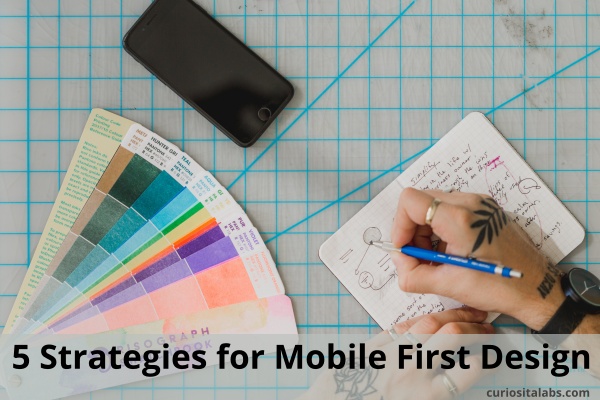
Photo by Matthew Henry from Burst
What mobile strategies can you use?
1. Keep your content short
Use writing tools like Grammarly and Hemingway to help you write better and keep it short.
2. Keep your site simple
Review your website. Look at the number of pages and links in your navigation bar. You may have too many. Consider getting rid of old and unnecessary pages and links. Are your pages cluttered? Do they have too much information crammed onto them? Use white space to add breathing room between different pieces of information. Can you reduce the number of columns you use to two or one? On mobile, you want to limit the number of columns used. Two or less is recommended.
3. Use Mobile First Design practices
Use white space, vivid colors, bold shapes and strong typographic elements in your design. Do you need to use photos? You can use a mix of stock and real photos to create a unique brand. Remember to optimize the photos for the web. Photos with large file sizes can slow your site down.
4. Make your site fast
Your site needs to load fast. People will leave a website with performance issues. On mobile, it is even more important. What can you do to speed it up?
- Test your site with Google’s PageSpeed Insights.
- Compress your images. How big are your images? You many need to compress or optimize them to make the page load faster.
- Install a CDN (Content Delivery Network) to help speed up your site.
- If you haven’t, switch to HTTPS.
5. Test and get feedback
How do you test your website without access to different devices and users? You have to test as best you can.
- Test your website with an online testing tool to see how it works on different devices.
- Test on many real devices as possible.
- Ask your co-workers or staff if they like how the website works.
Whether your visitors use a phone, tablet or desktop, you want to make the experience a good one. By designing for mobile first, you can make design decisions that help create a good user experience.
