7 UX Mistakes to Avoid

A bad user interface can lead to a bad user experience. Everyone has used apps and websites that are difficult to use. Or even confusing. Bad design choices can lead to a bad user experience. Choices like inconsistency, bad color decisions, too many fonts and confusing UI.

7 UX Mistakes to Avoid

Photo by Alvaro Reyes on Unsplash

What UX mistakes can you avoid in your next app?

1. Too many fonts

How many fonts are too many? Sticking with a couple of fonts makes it easier to read. Two or three. Use one or two fonts for your headings. One font for the body. Keep it simple.

2. Bad color contrast

Color contrast can mean the difference between easy to read or difficult. A bad color choice can make the text blend in with the background. Color blind and older individuals make have difficulty if you use the wrong colors. Check out the Best Ways to Evaluate Your Designs for Color Contrast.

3. Forgetting to label your icons

Many apps use the same icons. Icons like stars, hearts and check marks. These icons can mean different things in different apps. Use labels to help users know what the icon means.

4. Misleading users with links and buttons

Make sure that buttons and links do what you promised. It should take the user somewhere or do something. A general rule is that a link needs to go somewhere. Buttons allow a user to do something. Don’t use links to add, change or delete any data on the screen.

When do you use a button? First, consider what task you want the user to do. If they need to Buy, Sign Up or Add something, use a button. You may use secondary buttons for different tasks. Your primary action should stand out. For other actions like going to a new page, you can use a link.

5. Slow load times

Slow loading pages can annoy your users. Use tools like PageSpeed Insights to tell you what is slowing your site down. Images, fonts and videos can slow your site down.

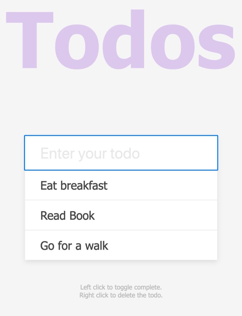
6. No way to distinguish a primary and secondary button

Sometimes you’ll have more than one action that you want the user to do. It’s important to make it easy for them to identify the primary action. Your primary button should be bolder and more prominent. Choose a strong color with bold text to help it stand out.

7. No text hierarchy

People scan your UI to figure out what to do. Text hierarchy helps them to know what to pay attention to. Use size, color and weight to show importance of text. Include spacing to separate different pieces of information.

Design mistakes can happen. You can create a better user experience by avoiding these common UX mistakes.

Posted in UX

Microcopy Tools and Tips

As a developer, you may overlook the tiniest bits of text on your app or website. The copy on your buttons, labels, tooltips and error messages can have the biggest impact. It can help your users to understand how to use your app or website.

Microcopy Tools and Tips
Photo by Med Badr Chemmaoui on Unsplash

Picking out the right words can help people to keep using your website or choose another. Use these tools and tips to help improve your microcopy.

1. Keep it casual

You want to convey a tone that is friendly and relaxed. Keep it simple and conversational. Address your users by using “you” and “your”.

2. Use simple, everyday words

Pick out words that talk to your users. Use the same language that they do. Avoid using complex jargon and words. Keep it short and to the point.

3. Be helpful

You want your users to keep using your app or website. Microcopy should help guide them. Pick words that help them to understand what is going to happen. Words like download, buy now, learn more or get more information.

Depending on what you want your users to do, you’ll want to confirm that they completed an action. Or shows an error message if it fails. You want to provide feedback to the user that helps them complete their tasks.

4. Use a microcopy tool

You can use an AI writing assistant or a microcopy collection to help you write better.

5. Test your copy

Not all copy resonates with your users. You may need to try different words before you find what works with your users.

Challenge your writing skills

Take the Daily UX Writing Challenge to practice writing better microcopy.

Learn more tips on improving your user experience with UX Writing.

Managing User Experience Debit

What is UX Debt? Like technical debt, UX debt piles up over time. Each design decision that you make can affect the user experience. Do you create a great user experience or ship your product? If you’re on a tight deadline, shipping wins.

Managing User Experience Debt
Photo by Sarah Pflug from Burst

What are the types of UX Debt?

There are two types of UX Debt — Intentional and Unintentional. Intentional debt occurs when you don’t have time or the resources to build your product right. Unintentional debt occurs over time. Design decisions that worked yesterday may not work today. Your users have changed and your UI hasn’t.

How do you manage it?

User Experience debt becomes a problem when you ignore it. Like technical debt, you need to manage how you handle it.

1. Determine where UX debt exists.

You need to figure out what issues you need to fix. Common places to look for problems are:

  • User Interface. Your buttons, links and visual styles may be hard to understand.
  • Content or copy. Check your written text, labels and headlines. They may be using confusing or hard to understand language.
  • Interaction Design. Is it easy to move from one page to the next?
  • Consistency. Does your UI look the same? Your elements should look and behave the same way.

How do you identify it?

  • Ask your users.
  • Use and analyze your analytics.
  • Perform regular user testing.

2. Focus on fixing debt

Not all issues are the same. Some need to be fixed right way. Others can wait until you have time. Rank the issues so you know which ones need to be handled first.

3. Build time into your schedule

Plan to tackle the UX issues that you have identified. If you don’t add them to your development schedule, you’ll forget to address them.

Learn more about UX Debt

Writing Semantic HTML

What is semantic HTML?

Semantic HTML is using specific tags when writing HTML. These tags convey meaning about their intended purpose. Both humans and computers can understand the meaning of your code when you use them. Browsers, search engines and assistive technologies use these tags to create a better user experience.

Matrix Binary Code
Photo By PixxlTeufel on Pixabay

Why should I use it?

It makes your code easy to read. You’ll be able to scan quickly through the code to understand how it is structured. Semantic tags also make it faster to write code. You don’t have as many decisions to make when you use the semantic tags.

How to get started?

HTML5 introduced new tags – semantic tags. Tags like <header>, <main> and <footer>. With these tags, you create a web page structure that is readable to both search engines and people.

Basic HTML 5 Code

Your main content lives inside <main>. You can use tags like <p> and heading tags like <h1> to provide some structure. To provide further meaning to the content, use tags like <article> and <section>. The <article> tag contains content that can be removed and put on another page. You can use the <section> tag when you need to wrap groups of related content. Use the HTML semantics cheat sheet to learn when to use which tags for the right job.

What about the <div> tag?

HTML has non-semantic tags like <div>. Its generic nature allows you to define its purpose through code. You can use the <div> and <span> tags in your code. Use them to group elements that don’t have any specific meaning. When you need more specific meaning, choose semantic tags over non-semantic ones.

Find out more about Semantic HTML

Filling Up Empty States

What are empty states? These are spaces on your app or web page which can be empty or blank. Screens or panels where no data or content displays. Why? Your users haven’t entered anything or data can’t be displayed.

empty room with wall wall and plant
Photo by: Darkmoon_Art on Pixabay

You might be familiar with empty states. Some typical scenarios are:

  • When a search returns no results
  • You have downloaded a new app and haven’t entered any data or content
  • An error has occurred
  • When you have deleted all of your data

What can you do? You could leave it empty. Or display information to the user. What kind of information would you put here? You want to use this space to communicate the app’s status. Teach new users how to get started or discover new features.

Communicate status to the user

When you use an app, sometimes you may wonder if it is working. This can occur when you run a search and get no results back. Or an error has occurred.

Silver Sneaker Location Search Error

Teach users how to get started

A blank or empty space can be intimidating to first time users. Use the space to teach your users what to do next, you help them to get started using your BMI Setup Guide

Starter Content

Show your users how to create new content with examples. Use starter content to give them an idea on how to fill the space. If you sharing photos, you may put a couple of photos in to demonstrate how that works.

Todo App with Starter Content

Summary

Don’t leave your users guessing what the app is doing. By using empty states, you help your users to get started using your app quickly. Learn how it works and be confident they can get what they want to do done. Refer to Designing Empty Spaces in Complex Applications to learn more.