What design patterns do you need to create an effective call to action? When you create a web design, you consider things like copy, color, fonts and images. The same things apply when designing your call to action.

Start with Copy
What should your call-to-action say? Use a minimal amount of copy. You want your visitors to scan your copy and quickly take action. Most calls-to-action have 1-2 sentences or a short bulleted list that convinces you to take action.
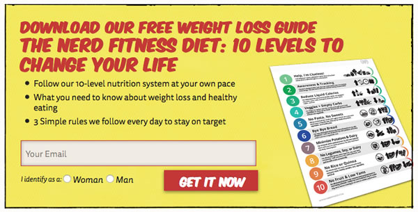
On NerdFitness.com, you can download a copy of their free weight-loss guide. Their copy uses a large heading that tells you want you are getting and 3 bullet points that explain what the guide entails. They use the copy to convince to give them your email address in exchange for their free weight loss guide.
Choose the right words for your Call-to-Action Button
You want to use words that get people to click. Start your button copy with a verb. Verbs like get, start or join. Avoid single word buttons. Instead use 2 or more words. You can add words like free or my to help people decide to click.
In the NerdFitness call-to-action, their button starts with a verb. They use “Get It Now” to convince you to download their guide.
Choose the right color for your button
Colors can affect whether or not people will click on your button. Your button need to stand out from the rest of the content. Be picky with the colors. Start with orange and test to see what colors work best.
Nerd Fitness used red. They use red on their website. It helps to make the button stand out and look like it belongs as part of the website too.
What size should your font be?
It depends. You may want to mix large fonts with small to make the copy stand out. Use a large font on your button to make it easy to read and entice your visitors to click on it. In the Nerd Fitness example, they use both large and small fonts. The size choices work to grab your attention.
How do you make it stand out?
Use photos, icons or background colors to make your CTA different enough from the rest of your content. Nerd Fitness used a yellow background, a black border and an image to make it different from the content of the page and compliment the rest of the design.
Summary
By combining copy, colors, fonts, buttons and decorative elements, you can create a CTA that entices your visitors to take the action that you want them to take. Not all CTAs work well. You may need to test and make changes to get the right design. Use these tips to incorporate current design trends when creating your next call to action.