Fonts come in all kinds of styles. With so many to choose from, it can be hard for a developer to know where to start. Your brand and voice are identifiable by your colors, photos, other design elements as well as the fonts that you choose.

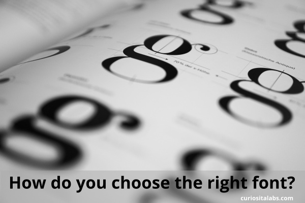
Photo by Florian Pircher from Pixabay
Use these following tips to help select that fonts that enhance your design.
1. What type of personality matches your brand’s tone?
Are you Traditional, Reliable or Respectable? If so, you want to choose traditional fonts like Butler, Georgia or Times New Roman.
How about Contemporary, Modern or Progressive? Try modern fonts like Simplifica, Raleway or Prime.
Or are you Strong, Bold or Stable? Strong fonts like Glamour, Code or Nexa might work for you.
Maybe you want to convey Elegance, Vintage or Romance. Try handwritten script fonts like Allura, Sofia or Pinyon Script.
If those don’t fit you, you may need a more custom or unique font. Stylish fonts like Butch or Moon may work for you.
2. Is the font easy to read?
Do you have to concentrate to read the words? If you are getting exhausted trying to reading the font, then your customers will too. You want them to be able to read without any effort.
3. Does it look good in different situations?
You want to choose a font that looks no matter what you do to it. When you bold or italicized it. It should be easy to read when large and small. Some fonts look better on top of photos. Your brand colors can affect how readable the font is.
4. Do the fonts look good together?
After you have chosen the type of fonts that convey your personality, you want to pair fonts that compliment each other. You’ll need to decide how your headlines, content and calls to action will look like. Pairing fonts can be challenging. You can learn the basics for choosing fonts that fit your personality.
You can use these additional resources for pairing fonts:
