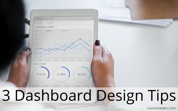
Dashboard design sounds simple. You want to create a way of presenting data to your users that is clean and easy to understand. Easy right?

Photo by: rawpixel.com from Pexels
No, dashboard design is more difficult than it seems. You need to consider your users before you can decide what data to present to them and how.
Ask these questions before you start building
- What data needs to be show to your users? You want to track a small number of key metrics. Not all data should be on a dashboard. Some data belongs in a report. If the data your considering is a summary or analysis, it may work better as a report.
- How am I going to present this data? You can choose to display the data as a chart, gauge, totals or a simple table.
- What actions do you want the user to take? Should they click on a link to open a report, update some information or do nothing?
Sketch out your design
After you researched and learned what data the user wants to see, you need to decide how to organize the data. You may find that you have too many pieces of information to present to the user. Sketch out your dashboard before you build it to determine what pieces of data go where. An easy to read dashboard has from 5-9 pieces of information on it. Remember that less is more.
Keep the design simple
You want your users to be able to scan the dashboard quickly. Help them by choosing to limit the number of pieces of information, colors, fonts and other UI elements. Your design should be minimal.
By asking questions before you build a dashboard, sketching out the design and keeping the design simple, you can give your users key pieces of information quickly.
More information on Designing With Data
Data Visualization Best Practices 2013
