Thoughts on programming, web development and design.

Circuit Board

Author: djbrensinger Page 32 of 50

From a Brochure to Website

Ideas for a website come form all kinds of sources. We went from a brochure to a website. My client wanted a website to let visitors learn what Historic Downtown Burlington Wisconsin had to offer. The downtown has historic buildings with great architecture and unique businesses.

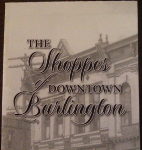
Started with a brochure

The downtown businesses had a brochure created that contained a map and information on their businesses. I used the map as a starting point. Then, I researched websites of historic downtown’s. I found a couple and looked at how they were organized and what kind of content they had.

he Shoppes of Downtown Burlington Wisconsin

Next, I created a paper prototype using the brochure to decide how to separate and organize the businesses based on categories. The businesses were separated into three categories: Shop, Dine and Visit. We added a history page, so people could learn a little bit more about Burlington, Wisconsin.

Vintage Design

After completing a paper prototype, I researched vintage design. I learned what type of colors, fonts and other decorative elements that were used. While I researched vintage design, I found an old poster that inspired the initial color scheme. Once, I had the color scheme and fonts, I created a prototype using Adobe Fireworks. I worked with the client to make a few adjustments to the logo and the overall design.

From design to website

We decided to build the site in WordPress using a custom theme. I created the custom theme using the Toolbox Starter theme. Then, I added the original content from the brochure to the site. As the client reviewed the site, the client wanted to make a few changes. We added additional businesses, more pictures of the downtown and altered the color scheme.

Historic Downtown Burlington WisconsinWhat I Learned

Every project is unique. Some go smoothly and others do not. While working on this project, I learned at least three things:

  • Your color inspiration doesn’t always translate well to a website. What looks good as a poster, may not translate well as a website. The colors I chose were too strong for a vintage design.
  • Pinterest is a great tool for researching. I found a board that had Vintage Design color schemes. This board helped in deciding which colors to change and which ones to keep. Our end result gave the site a more historical look.
  • Taking photos of the businesses was challenging. My camera picked up the reflection of the street on the windows. I discovered that removing it with Photoshop is time-consuming. With practice, l learned how to find the best angle to limit the amount of reflection.

Have you built a website from a brochure?

Responsive Design Process

Computer CodingResponsive Design focuses on building websites that work on different devices. Your web designs should look good no matter what device your user is using. Responsive design requires changing how you build websites. There are many techniques for developing a responsive design. Tristan on Heliomblog suggests adopting a responsive web design process. This process emphasize content first. Web design works best when you have the content completed first. Then, use a mobile first strategy. It is easier to add on to a design for desktop users than it is to take things away for mobile.

No design and development process is perfect. You have to make changes as you discover what does and doesn’t work in your design. Design is solving problems, not just making things look pretty.


Related Article

Bootstrap 101 for Developers

At the PHP Meetup, we discussed using Bootstrap to build a web app. Here are my notes from Bootstrap 101.

4 Basic Principles of Design

Developers who create web apps should be familiar with the 4 basic principles of design: Proximity, Alignment, Repetition and Contrast.

Proximity

The way elements are grouped together to create a sense of unity

Alignment

  • Place items in relation to other items; do not place them arbitrarily.
  • Grid Theory
    • Use the Golden Ratio (Divine Proportion)
    • Remember the Rule of Thirds You want to place elements in spots where a person is naturally drawn to.
    • Use tools like a 12 Column Grid or gridulator.com which makes grids for you

Repetition

Use elements repeatedly in your web app. Users expect consistency in your design.

Contrast

When 2 items are different, they should compliment each other and not conflict. When you do, you have contrast. Such as when you use white text on a black background.

Use Bootstrap to speed up your development

Computer with codeWhy use Bootstrap? Bootstrap is a front-end framework. It uses CSS and JavaScript. Bootstrap is cross browser and cleans up CSS by using Normalize. CSS is built using LESS. It helps you to speed up web development. You can make good looking apps quickly. Since you can use Bootstrap to build your front-end quickly, you may be tempted to use the defaults. Don’t. You can modify Bootstrap quickly and effectively.

Have you used Bootstrap to build web app?

3 Tips for Building and Designing Web Apps

Computer CodingWhat is a web app? A web app is an application that uses a web browser and technologies to collect data from a user, do something with the data and then return the results to the user. Some websites are web apps, but not all websites are web apps.

Websites and web apps use some of the same web technologies: HTML, CSS and JavaScript. Many web apps use a database to store and interact with user data. When you build your first or next web app, consider the following tips:

  1. Tips for Building Your First Web App has a list of general tips that both beginners and seasoned developers need to remember when build a web app. Your web app should focus on the data relationship. What data do you take in, how is it presented to your users and what features does it have.
  2. You need to design a good looking web app. Bootstrap is one tool that you can use. Developers can quickly design a web app without having to be a designer too. Vandelay Design has gathered 13 resources to help you design your web app with Bootstrap.
  3. You want your web app to be used by people no matter where they are or how they access it. To do this, your web app must be responsive. Use these tips to make your web app responsive.

6 Web and Mobile Application Inspirations

How do you decide to try a web or mobile application? One way is to look at their website. When considering an app, I look at their website for screenshots, a video tour and information on how the app works. An app website with these elements can help me decide whether or not to try this app. I have complied a list of 6 web and mobile app websites that contain these elements.

Freckle

Freckle is an online web application that lets you track your time. The site opens with an introduction to Freckle. It has a banner image that contains screenshots of the application. This image gives you a quick overview of what you will get when you use this app. If you want to take a tour of the app, they provide you with three different links to the video tour. The color scheme complements the content and helps guide you to the information that you need.

Freckle

InnovaStudio LiveEditor

InnovaStudio LiveEditor is an web-based HTML editor that you can include in your CMS and web applications. Their website uses an image rotator to show why you will like this app. If you want to see the app, you can choose to try out a live demo or a video demo. The bottom of the page includes screenshots of the app. They use a minimal design which helps you focus on the app and not figuring out how to use the site.

InnovaStudio LiveEditor

Blinksale

Blinksale is an online invoicing web application. Their website has a screenshot that shows the application and lists what you get when you use this app. Instead of a video tour, they use FAQs and Testimonials to help you decide if this app is right for you. The color scheme helps you to focus on the different sections of the page.

Blinksale

Bluenote

Bluenote is an app that allows you to store notes, passwords and tasks in one app. Their website rotates through the screenshots of the app in two different sections of the page. It also includes rotating testimonials from people who have used the app. Bluenote uses a blue color scheme on the website and app. The contrasting blues and white text make the site easy to read and organize the page.

Bluenote

FieldNotes

FieldNotes is mobile app that allows you to take notes while on the go. You can take photos and record voice notes, video and your location. FieldNotes uses a black, white, gray and blue color palette. They use two different colored backgrounds to help you focus on the purpose of each section; top is for showing the app and the bottom is for describing it in detail. FieldNotes rotates screenshots of the app inside an iPhone. They provide reviews, a demo video and FAQs. FieldNotes provides you with enough information to help you decide whether or not you want to try the app.

FieldNotes

Air Display

Air Display is an app that can turn your iOS device into a a second display. It does this by installing the app on your iOS device and drivers on your computer. The website uses a black, white, and gray color palette. On the Air Display page, they use the color red to make the buy button stand out. The main focus of the site is to rotate through screenshots of the app on a monitor and iOS device. Below the app demo and buy button is the section that describes what you can do with Air Display and lists some uses and driver plus app compatibility.

Air Display

Page 32 of 50

Powered by WordPress & Theme by Anders Norén