You are building a new website with Bootstrap. The default theme is not fancy enough for your project. Should you create your own custom theme from scratch? What if, you don’t have time to create a new theme and you still want something custom? You can download a Bootstrap UI kit to help you get started.
What is a UI kit?
A UI Kit contains styles and components that you use as a starting point to build an attractive and consistent user interface. With a Bootstrap UI Kit, you can customize a Bootstrap website to fit a specific design without starting from scratch.
Here are 5 different Bootstrap UI kits for you next project to consider. They use popular design styles like material, flat and more. You can use these UI kits for building a simple website or a custom web application.
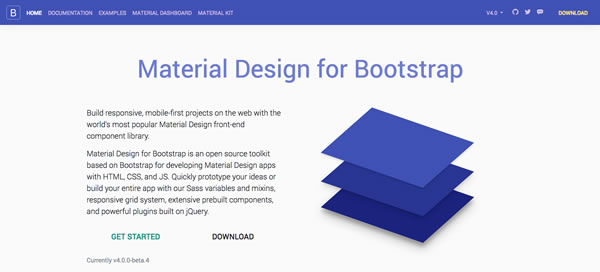
1. Material Kit
Want to use material design in your Bootstrap project? You can use Material Design for Bootstrap to develop a responsive, mobile-first projects. With this kit, you can use HTML, CSS and JS to build prototypes quickly. If you like the free version, you can also purchase pro versions. With the pro versions, you get more components and can build dashboard apps with material design.
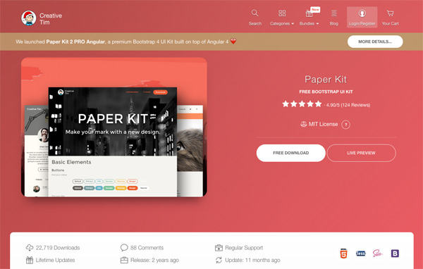
2. Paper Kit
Paper Kit is a free Bootstrap UI kit. This kit from Creative Tim allows you to create something different. Paper Kit was inspired by paper and drawings. It uses pale colors, includes sample pages and beautiful typography. You also can customize this kit to make it your own.
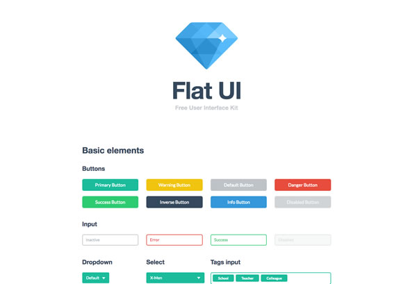
3. Flat UI Kit
Want to use flat design in your Bootstrap project? You can use Flat UI to create a website with flat design. Flat UI provides flat design on buttons, drop downs, navigation, icons, colors and more. You get samples that you can use to customize your own design.
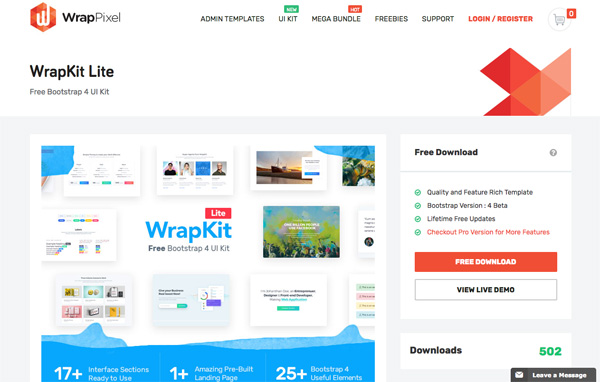
4. Wrap Kit
WrapKit Lite is a Bootstrap 4 UI Kit. It includes Google Web Fonts, Sticky Headers, CSS Animations and more. WrapKit Lite is easy to customize and build your own website quickly.
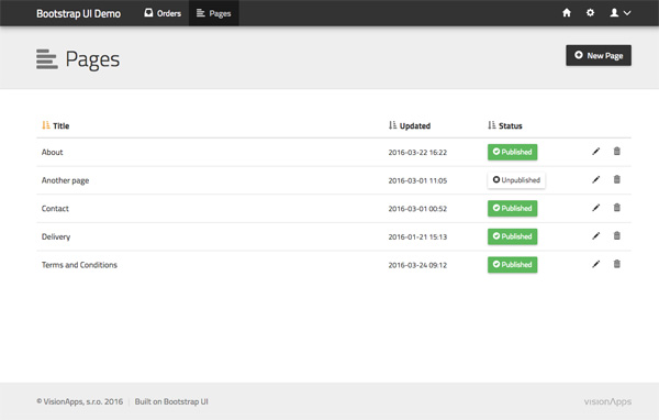
5. Bootstrap UI
Are you building a web application? Bootstrap UI provides you with components to build a beautiful web application. It includes typography, Bootstrap Grid, stick footer, tabbed navigation, list groups and standard Bootstrap navigation.
With these Bootstrap UI Kits, you can quickly customize your Bootstrap project without starting from scratch. When you need to use material, flat or a different design type, UI kits can help you get started.
What are your favorite UI Kits?