Thoughts on programming, web development and design.

Circuit Board

Category: Design Page 15 of 22

7 Favorite Web Development Tools

Web developers use a variety of tools to build web sites and web applications. A typical project may require you to use a code editor, photo editor, online code or font generator and more. I have complied a list of 7 web development tools to help you solve specific problems.

Free Photo Archive

The current advice is to be choosy about when you use stock photos. If you choose to use stock photos and have a limited budget, use a free photo archive like Morgue File. With a photo editor like Photoshop, you can customize the photo to fit with your website.

Convert Pixels to Em

Not sure how to calculate the number of ems in pixels or vice versa. Use pxtoem to convert pixels to ems, points to pixels and even percentages. You can use the chart to find the answer you need or use the custom calculator.

px to ex

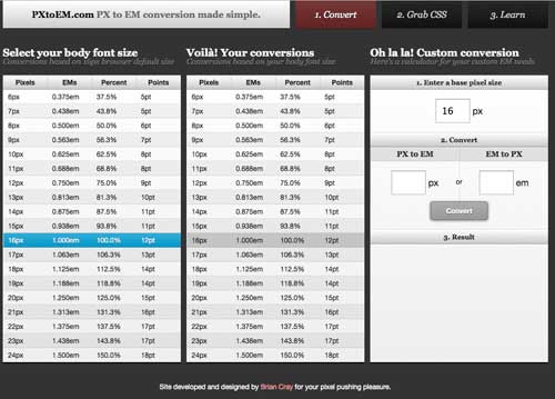
Convert pixels to ems and more

Icon Fonts Generator

Fontello is an icon font generator. You can choose from available icon fonts like Font Awesome or create your own customize set of icons. Pick and choose the icons that your need to ensure a consistent look and feel on your website.
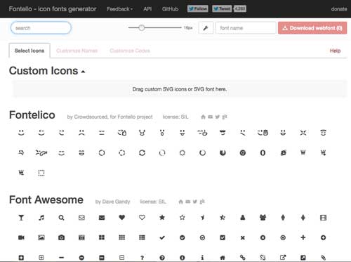
Fontello

Generate icon fonts

Color

Picking a color palette for your website can be challenging. You may have any idea of some colors that you want to use. If you need inspiration, you can use a color palette tool like Adobe Kuler. Adobe Kuler allows you to create your own color palette or explore pre-made themes (color palettes).

When you work on a project, you may need to create a border or a gradient and you want to keep within the same color variation. 0to255 lets you pick a color and choose from the variations of that color. You can use it to simplify the process of choosing colors.

Font Generator

Need to choose fonts for your website? Awesome-fontstacks lets you mix and match your fonts. You use the wizard to walk you through selecting the fonts for your website. Once you have the fonts that you like, you can generate the CSS @fontface code. To use, download the fonts, save the fonts and CSS to your website.

Awesome Font Stacks

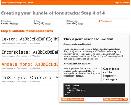
Choose fonts for your website

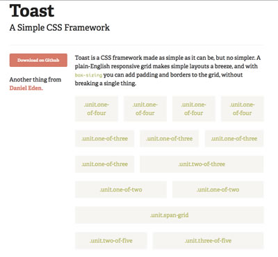
Responsive Grid Generator

Grid layouts make designing your website easier. You may choose to build your own framework, use an existing grid framework or create one with a grid generator. Gridpak is a responsive grid generator. You tell it how many columns, the amount of column padding and gutter width. It generates the grid. You can view it right away to see how your choices would look. Once you like it, you can download the framework and apply it to your design.

With tools like these, you may speed up the process of building a website. Tools are to help make your work easier not harder. Not every project is the same. You need to select the tools that fit the job. This short lists gives you a few more tools to choose from.

What tools do you use when designing and developing your websites?

Related Article

Your own or a pre-built CSS Grid

Your own or a pre-built CSS Grid

Bootstrap is a popular design CSS grid framework. A CSS grid framework consists of a specific number of columns and rows. You can quickly define different layouts using a grid framework. It helps you to quickly build the layout of your web application.

What if you want something really simple? You just want a simple grid and create the rest of the design yourself. Do you choose a pre-made CSS Grid framework or build your own? It depends on your preferences and project needs. If you need to complete your project quickly, choose a pre-made framework. If not, you may choose to build your own to use in later projects.

Simple and Responsive Grid Frameworks

Try out one of the following simple and responsive pre-made grid frameworks:

Toast - Simple CSS Grid

Toast – Simple CSS Grid

If these don’t work for you, a quick Google search provides you with more options to try.

Build your own framework

Why build your own framework? Most developers like working with code that they understand and have control over. With a pre-made framework, you have to deal with the choices that the developer made to get their framework working. You may not have the time or patience to attempt to fit another’s framework to your project.
To build your own framework, you need to:

  • Determine how many columns 9, 12 or 16? The standard number of columns is 12. 12 makes it simple.
  • Sketch out a design.
  • Create the structure for the grid framework. You don’t have to make it complicated. The best grids are simple.
  • Test out the HTML and CSS for the grid framework.
  • Make it flexible and responsive. You want your grid to work with your future projects: mobile and beyond.

Building your own framework doesn’t have to be an overwhelming challenge. Check out how Joe Richardson built a responsive grid system.

Are you going to build your own?

4 Tips for Improving Your Web Design

Art PencilsDesign is problem solving. Whether you are creating an app or a website, you need to focus on solving a problem, not just making it look pretty. When you design, you need to make an impression, create something usable, solve the right problems and improve when your design has flaws.


The following tips can help you improve how you design.

Make an Impression

You have 3-5 seconds to make an impression. If you don’t, your website visitors will leave. You have to make design decisions that convince your visitor to stay. Designing for the 3 Second Rule gives your 5 tips that you can do to make certain that your design will have impact.

Design for Activities, Not Users

Most people go to a website to do something: read, watch a video, or post pictures. You need to consider what they plan to do on your site. When you focus your design on a person or group of people, you can create a web site or app that has too many features. By focusing on activities instead of users, you can build a better website. In Stop Designing for “Users”, Mike Long explains why designing for activities is a better for your design.

Apply App Design to Website Design

Can you use app design to create better websites? App design can provide a source of inspiration and guide for solving certain problems. Kayla Knight explores how you can apply app design concepts to website design. She talks about planning layouts, focus on the user’s reason for coming to the site, solving problems first and making it pretty second.

Test for Usability to Improve Your Design

When you develop an app, some features are easier to use than others. You don’t always get it right with your design. Testing helps you to identify the flaws in your design. Joshua Gross explains How Usability Testing Drastically Improved My Client’s App.

When you create an app or a website, you are solving a problem. You want to be able to impress your visitors to use your app or stay on your website longer. Use app techniques like focusing on activities, instead of a group of users. People come to websites because it answers a question, invites them to play a game or chat with their friends. Test your app. Testing helps you to see how the app or website works when your visitor uses it. By testing, you may see ways to improve the experience for your visitors.

Design requires that you make choices. Those choices affect how a website looks and works. Use these techniques to help you make better design decisions. Do you have any additional suggestions for improving your web design?

Related Article

Web Design and Personal Responsibility

At Webstock 2013, web designer, Mike Monteiro, gave an inspiring talk called “How web designers destroyed the world”. His talk focused on design and personal responsibility. Designers and developers create new things every day. Mike wants you to realize that what you create has an impact on the world around you. A simple change could affect the lives of your users. Don’t just add features because the client wants it. Look at how the change will impact all of your customers.

Design is about solving problems not making things pretty. Mike want designers and developers to focus on solving real problems. Not just creating another me-too app. He showed a screen filled with camera apps. Do we really need more of them?

If you want to do more than build me-too apps, watch the video.

Webstock ’13: Mike Monteiro – How Designers Destroyed the World from Webstock on Vimeo.

From a Brochure to Website

Ideas for a website come form all kinds of sources. We went from a brochure to a website. My client wanted a website to let visitors learn what Historic Downtown Burlington Wisconsin had to offer. The downtown has historic buildings with great architecture and unique businesses.

Started with a brochure

The downtown businesses had a brochure created that contained a map and information on their businesses. I used the map as a starting point. Then, I researched websites of historic downtown’s. I found a couple and looked at how they were organized and what kind of content they had.

he Shoppes of Downtown Burlington Wisconsin

Next, I created a paper prototype using the brochure to decide how to separate and organize the businesses based on categories. The businesses were separated into three categories: Shop, Dine and Visit. We added a history page, so people could learn a little bit more about Burlington, Wisconsin.

Vintage Design

After completing a paper prototype, I researched vintage design. I learned what type of colors, fonts and other decorative elements that were used. While I researched vintage design, I found an old poster that inspired the initial color scheme. Once, I had the color scheme and fonts, I created a prototype using Adobe Fireworks. I worked with the client to make a few adjustments to the logo and the overall design.

From design to website

We decided to build the site in WordPress using a custom theme. I created the custom theme using the Toolbox Starter theme. Then, I added the original content from the brochure to the site. As the client reviewed the site, the client wanted to make a few changes. We added additional businesses, more pictures of the downtown and altered the color scheme.

Historic Downtown Burlington WisconsinWhat I Learned

Every project is unique. Some go smoothly and others do not. While working on this project, I learned at least three things:

  • Your color inspiration doesn’t always translate well to a website. What looks good as a poster, may not translate well as a website. The colors I chose were too strong for a vintage design.
  • Pinterest is a great tool for researching. I found a board that had Vintage Design color schemes. This board helped in deciding which colors to change and which ones to keep. Our end result gave the site a more historical look.
  • Taking photos of the businesses was challenging. My camera picked up the reflection of the street on the windows. I discovered that removing it with Photoshop is time-consuming. With practice, l learned how to find the best angle to limit the amount of reflection.

Have you built a website from a brochure?

Page 15 of 22

Powered by WordPress & Theme by Anders Norén