Curiosita Labs

Thoughts on programming, web development and design.

Circuit Board

How to build Landing Pages for your website

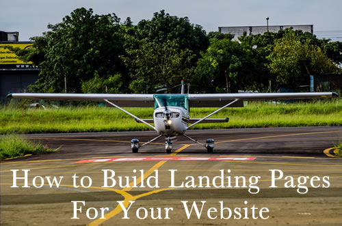
Do you have landing pages on your website? A landing page is a high focused page that has one call to action and targets a specific audience. This type of page can be temporary like getting people interested in an event or a webinar that you are host. Or it can be permanent page that you use to get people to purchase your eBook or new product.

Build a Landing Page

Here are some tips I learned from a recent talk on building landing pages:

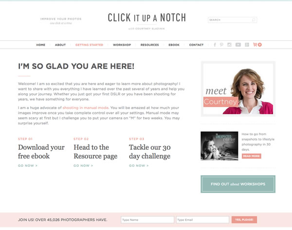
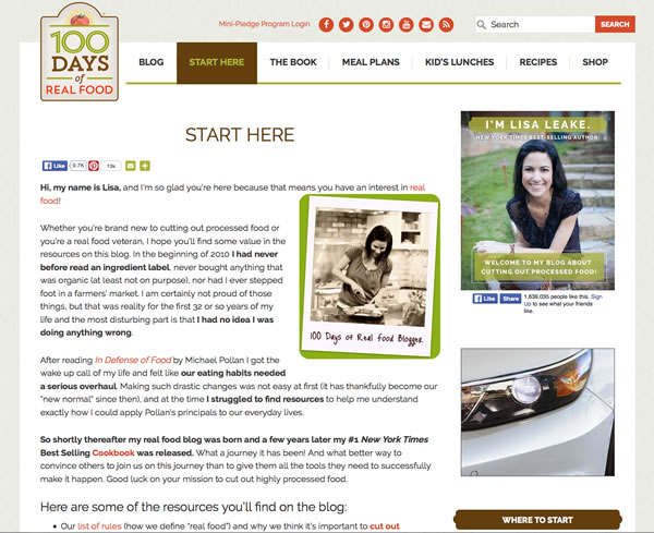
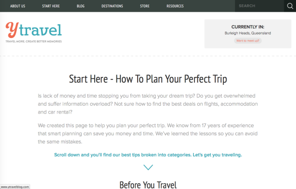
What should your landing page have?

  • Heading and Subheading. Use headings and subheadings to break up the content and make it easier to read.
  • Content. Write quality content that speaks to your audience.
  • Key Benefits and Features. People like to know how you can help them solve a problem that they have.
  • Social Proof. Get people who like your product or service explain how you helped them.
  • Social Share. Provide links to social media, so people can share your website.
  • Call To Action. Your landing page should have one step that you want people to take.
  • Lead Intake Form. Provide a form so that people can get in touch with you for more information.
  • Little or no navigation bar. You want to keep them on the page. Navigation bars provide a way to leave your page quickly.

How do I drive traffic to my landing page?

  • Email. You can get people to your website through email newsletters.
  • In Person. When you meet people, whether at a conference, networking meeting or anywhere else, tell them about your website.
  • Blog. Either write a post on your own website or guest blog post on another site. Blog posts can bring visitors to your site. Weeks or months after you have written the post.
  • Social Media. Share the link to your website. People will share links if it is helpful, interesting or helped them solve a problem.
  • Video. Create a video and include a link to your website in the video.
  • Custom Business Cards. Make custom business cards for an event such as networking that includes a link to your website.

What parts of the landing page should I test?

  • Headlines. They can help or hurt your results. Try different headlines to see if you get a better response.
  • Images. Your landing page should use photos, graphics or icon. Different images can help sell your story.
  • Text. Your text is an important part of your landing page. Experiment with different types of content: lists, testimonials, or stories.
  • Call to Action. Change your call to action. Try “Getting Started” vs “Buy Now”.
  • Page Layouts. Single column, two columns or three columns can help you organize your page. Try rearrange your page to see if one, two, three or a combination of columns works better.
  • Other design elements. Experiment with color, fonts and other design element. Color can font choices can influence how people perceive your website. Your intended audience may respond to different choices.

What tools and apps can I use to make my landing page?

  • WordPress
  • OptimizePress
  • Gravity Forms
  • X Theme
  • LeadPages
  • Optimizely

Additional tools to make your landing page better:

  • Copyblogger. You’ll find tips and techniques on copywriting, marketing and more.
  • Google Analytics. Use to measure how much traffic your page is getting and to help you make adjustments to your page.
  • Hubspot. Use their software to help you streamline and increase your sales and marketing efforts.

Summary

Landing pages are different from other pages on your website. It can be a permanent or temporary page. You want the page to be focused on a specific audience and topic. By using different elements like headlines, call to action, social proof, lead intake form, copy and photos, you can create a landing page that fits your target audience. Test and experiment with different elements to create a landing page that works for your intended audience.

‘Start Here’ What should you have on it?

New readers come to your website from a post or found your site through Social Media. Do they know where to start? How do you help them learn what to expect? You can create a ‘Start Here’ page.
Start Here

What is a Start Here page?

A Start Here page is a summary of what your readers can expect. You showcase your best work to keep new readers interested in your content.

What should I have on my start page?

  • A summary of what your readers can expect to find on your website
  • Links to your top articles
  • Links to your categories
  • A video introducing your readers to you and your website
  • Links to your newsletter and social media sites

Start Page Examples

Click It Up a Notch

Click It Up A Notch
Click It Up a Notch has the following elements:

  • Summary of what the website is about
  • Links to top articles and resources
  • testimonials
  • a letter to beginning photographers
  • Courtney’s profile and a link to find out about Workshops she offers

100 Days of Real Food

100 Days of Real Food
100 Days of Real Food uses the following:

  • A summary of what 100 Days of Real Food is about and why Lisa started this blog
  • Three different lists of resources to help you to get started with the blog and real food
  • A link to learn more about Lisa Leake
  • A section on sponsors that you might find interesting
  • A footer section that has her newsletter sign up, book and quick links

Y Travel

YTravel
Y Travel uses the following:

  • A summary of how to plan the perfect trip
  • Three links on Before Your Travel, Travel Research and Planning, and to help you determine your travel style
  • A section that asks you to get started on your travel dreams and join them.

Should your website have a Start Here page?

Is your website a blog? A community site? For blogs and community sites, a Start Here or Getting Started page can be a good tool to have. It helps new readers learn more about you. They can sign up for your newsletter and follow you on Social Media if they like what they see.

Want to learn more about creating effective start pages?

Check out the following resources to learn more about adding a start page to your blog.

Should you build a website with a static site generator?

How do you build a website? For most developers, there were only two options to choose from. You create a website by hand coding every single page in HTML, CSS and JavaScript. Or you use a content management system like WordPress. Now, you have a third option. You can use a static site generator.

Static Site Generators

What is a static site generator?

Static websites don’t require a database. Each page displays images, videos and text. They don’t pull information from a database when you go to the page or do something on the page. You can build a static website using a text editor. A static site generator helps you to build a website quickly. It creates all of the html code for each web page. A generator lets you focus on the important part, the content, not the structure of a web page. One of the popular generators, Jekyll, lets you create websites and blogs.

Why would you want to use a static site generator?

  • Pages built in HTML load faster. They don’t have to make calls to a database in order to display a page.
  • You can control how the website looks. When you use a Content Management System (CMS), you must build your website the way the CMS wants.
  • Your website is too small for a CMS. For some projects, a CMS can be overkill. You wanted a site with 5 pages that lets people know about your business. A CMS has features that aren’t needed by this website.
  • CMS’s require continual maintenance. Your CMS may make changes to improve functionality and security. Any themes or plugins that you use may have additional updates that will need to be monitored and updated as needed.
  • Better Security. A CMS has a database, a login and other code that opens the site for attack. This can make it harder to find problems. You may have to start over by deleting everything including the database. With a static site, attackers have little or no opportunities to damage your site. They would need to gain access to your web host to damage your pages or upload malware. When that happens, you can change your password, delete the site and re-upload it again.

Why you should use a CMS instead of a static site generator?

  • Your website has a large number of pages to maintain. A CMS makes updating and changing a website quick and easy.
  • No administration. You have to know markup and generator tools in order to make a simple change.
  • Limited themes or other resources available. If you want to do something like moderate comments, you have a limited number of options. With a CMS, you can choose from readily available plugins or themes to do what you need.
  • Your client wants to update their website themselves. Static site generators currently lack an administration interface to make this easy.
  • You can’t decide which static site generator to use. With a CMS, you choose one of the popular ones: WordPress, Drupal, Joomla or Kentico. Static Site Generators come in many different flavors. You have to decide what programming language it is written, what kind of website you are creating and more in order to narrow you selection down.

How do I choose a static site generator?

You’ve decided that a static site generator is a good solution for your project. With many static site generators to choose from, which one do you chose? First, Use staticgen.com to review the Top Open-Source Static Site Generators. It allows you to sort by languages, stars, issues, forks and name.

Then, ask yourself the following questions to narrow your choices down:

  • What type of site are you going to make? Some static site generators work better for a blog.
  • What programming languages are you familiar with? You can choose from JavaScript, Ruby, Python, Go, PHP and more.
  • What templates does it use? Liquid, EJS, or Jade.
  • What type of license? MIT, BSD, or APL 2.0
  • How many people use this generator? The more popular it is, the more likely you can get help when you need it.

Summary

Is your next web project going to be built with a static site generator? A static site generator can help build a fast and functional website without the extras that a CMS needs. Static Site Generators as well as CMS’s have strengths and weaknesses that affect the design of your website. As with any web project, the type of tools you choose should work with the content you intend to put on the website and not against it.

What to learn more?

Mobile Design Typography

Content is the most important element of your website. With a wide range of mobile devices available to people, your websites and apps must be readable on all. To maintain the readability of your content, you need to consider the fonts you choose, size, contrast and line length. How do you use Mobile Design Typography to make your content responsive and readable?

Mobile Design Typography

Fonts

Not all fonts look good on a small screen. Display fonts like script fonts may look good on a desktop screen, but on mobile they can shrink down too small to read. A script font like League Font is fine for the desktop, but on mobile it can be unreadable.

League Font

What are your options?
You could increase the size of the font. At a larger size, your chosen font may be look better. Or you could replace the font with one that is readable on small devices. You have to decide if you really need to use this font in your design.

Size

Size is also important. Too small and your content is unreadable. People leave sites if they can’t read it on mobile. If you choose a size that it too large, it could dominate the content. It could take up so much space that you end up scrolling constantly while reading the page. You have to find a size that works well at that size.

Line Length

How long should a single line of text be? It depends. Readability is determined by the font, character and word spacing and the word lengths. Even the device that you are using can affect readability. A general guideline is 9 – 12 words per line. 9 – 12 words is a comfortable range for people to read. Line Length and Column Widths explains why your text should be about 9 -12 words long.

Contrast

What is contrast? Contrast is how every element in a design which includes font, size, color, line length and images works to create a good user experience. The easiest to learn is color. How do your color choices affect the design? With mobile design, you need to also think about size, font, line length, position and shapes. On Web Designer Depot, John O’Nolan explains how to fully understand contrast in design. He shows you how to use them for a better user experience.

Horizon Coworking in Madison, WI

Summary

Your content is an important element of your design, especially on mobile. When developing for mobile, consider how the font type, size, line length and contrast can effect the readability of your site. If it isn’t readable, your visitors will leave. Keep them on your site by focusing on how fonts look on mobile.

For more information on Mobile Typography, check out these articles:

3 Milwaukee Area Bike Web Design Inspirations

What is your favorite bike shop or company? After taking my bike in to fix a tire issue, I complied a short list of local Milwaukee Area Bike Shops. Each one of the bike shops uses photos to help you navigate the site and show the personality of the company. From this short list, you can discover ideas for incorporating custom photos into your site.

Wheel and Sprocket

Wheel and Sprocket
The best feature of Wheel and Sprocket’s website is the two rows of colored navigational boxes. They are simple, attractive and to the point. When you hover over a box, the background changes to a photo. The photo works perfectly with the subject of the box.

Fyxation

Fyxation
Fyxation makes good use of photos. They show off their bikes in the slide and also uses photos as part of their secondary navigation. This section is a single row of photos with text on it. The text helps you to decide if you want to click on the photo to got to that part of the web.

Vulture Space

Vulture Space
Vulture space is a non-profit bike shop in Milwaukee. Each page has a short amount of content on them. They use custom photos to show off the personality of the bike shop and the people who volunteer there.

Summary

As a cyclist, I like the mix of photos of bikes and people with or on bikes that each website uses. Each site incorporates minimal design to help you find what you are looking for on their site. When you design your next website, you can think about how you want to incorporate custom photos into your site.

How have you use custom photos in your web projects?

Page 27 of 52

Powered by WordPress & Theme by Anders Norén