
Last week, I attended the dotNetConf Virtual Community Conference. This two day conference had speaker talking about ASP.Net, Open Source and more. One of the talks was on Mobile First Responsive Design. Shawn Wildermuth talked about the differences between standard Responsive Design and Mobile First. He showed you how to design your site from mobile to desktop.
Month: April 2013
 You’ve built your website. The site gets enough traffic, but you want it to do better. What things can you do to build a better website? Speed, images, navigation and forms can help or hinder how your audience works with your website.
Does your site load fast?
Check your site for speed issues. A slow loading website with make people leave your site if it takes too long. Two of the simplest checks are image sizes and the location of JavaScript in your web page.
Images with large file sizes take longer to download than smaller sized files. You can use PhotoShop or another photo editor to shrink down the size. If that doesn’t work, consider using Smush.it to remove unnecessary bytes from image files.
JavaScript’s location in your web page has an impact on the speed of the site. You need to determine if a specific script need to be in the head tag or placed before the end body tag. When a web page loads, it stops loading the page when it sees a JavaScript. It processes the JavaScript before continuing to load the rest of the page. If you have several JavaScripts, it has to process each one. To improve speed, you need to move the scripts that don’t impact the page immediately to the bottom of your page.
Do you have images that work?
Too many, not enough or even the wrong type of images can turn off visitors. You want the images that you use to help your visitors to decide to stay on your site and to do something. Whether that is sharing your article, buying a product or signing up for your newsletter. To help use images to make your site more usable, 1st Web Designer has some tips on how to use images effectively.
Can your visitors find what they want?
Your navigation menu is an important tool to help your users find what they are looking for. If your visitors have to use two or three clicks to find anything, you need to reconsider how you have organized your site. To create effective navigation, you need to use words that your visitors will understand. Standards like About Us, Home, Contact Us, Products and Services help people to navigate your site. You may want to add features like a sitemap or additional navigation at the bottom of each page. Your design can help visitors too. By being consistent with colors, word choices and images, these design choices can help your visitors interact with your site.
Are your forms easy to use?
Forms that look like a tax form is going to make your visitors leave. You want to build forms that are easy to use, guide the visitor and quick to fill out. If you need ideas on how to build a better form, get inspiration from these 5 Web Form Designs.
By looking at speed, navigation, images and more, you can improve the overall experience for your visitors.
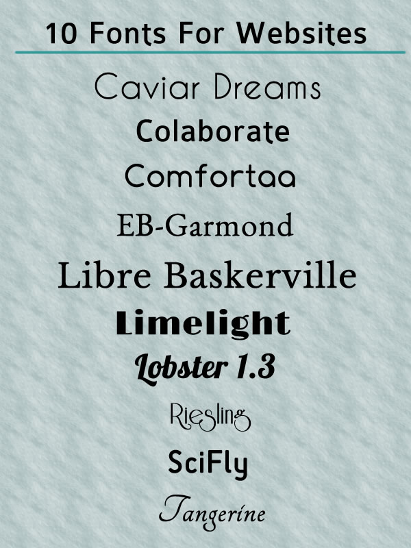
Fonts are a great way to add personality to your websites. Before CSS3, you couldn’t easily add fonts that weren’t supported by the browser. In CSS3, let you add the fonts that you want to use. This means you no longer are limited to fonts using web-safe fonts. By using the @font-face rule, you can add more style to your website. I have complied a list of 10 free web fonts for you to experiment with. All of these fonts can be downloaded from FontSquirrel. You can also download the @fontface kit, so you can easily add the fonts and CSS to your website.
Links to Web Fonts
Caviar Dreams, Sans Serif
Colaborate, Sans Serif
Comfortaa, Sans Serif
EB-Garmond, Serif
Libre Baskerville, Serif
Lobster 1.3, Script
Riesling, Retro
SciFly, Sans Serif
Limelight, Retro Style
Tangerine, Calligraphic