Thoughts on programming, web development and design.

Circuit Board

Category: Design Page 12 of 22

Mobile Design Typography

Content is the most important element of your website. With a wide range of mobile devices available to people, your websites and apps must be readable on all. To maintain the readability of your content, you need to consider the fonts you choose, size, contrast and line length. How do you use Mobile Design Typography to make your content responsive and readable?

Mobile Design Typography

Fonts

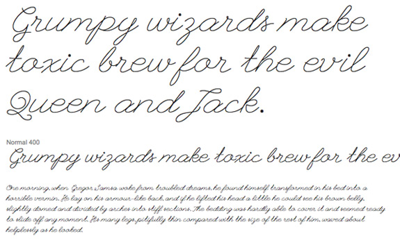
Not all fonts look good on a small screen. Display fonts like script fonts may look good on a desktop screen, but on mobile they can shrink down too small to read. A script font like League Font is fine for the desktop, but on mobile it can be unreadable.

League Font

What are your options?
You could increase the size of the font. At a larger size, your chosen font may be look better. Or you could replace the font with one that is readable on small devices. You have to decide if you really need to use this font in your design.

Size

Size is also important. Too small and your content is unreadable. People leave sites if they can’t read it on mobile. If you choose a size that it too large, it could dominate the content. It could take up so much space that you end up scrolling constantly while reading the page. You have to find a size that works well at that size.

Line Length

How long should a single line of text be? It depends. Readability is determined by the font, character and word spacing and the word lengths. Even the device that you are using can affect readability. A general guideline is 9 – 12 words per line. 9 – 12 words is a comfortable range for people to read. Line Length and Column Widths explains why your text should be about 9 -12 words long.

Contrast

What is contrast? Contrast is how every element in a design which includes font, size, color, line length and images works to create a good user experience. The easiest to learn is color. How do your color choices affect the design? With mobile design, you need to also think about size, font, line length, position and shapes. On Web Designer Depot, John O’Nolan explains how to fully understand contrast in design. He shows you how to use them for a better user experience.

Horizon Coworking in Madison, WI

Summary

Your content is an important element of your design, especially on mobile. When developing for mobile, consider how the font type, size, line length and contrast can effect the readability of your site. If it isn’t readable, your visitors will leave. Keep them on your site by focusing on how fonts look on mobile.

For more information on Mobile Typography, check out these articles:

3 Milwaukee Area Bike Web Design Inspirations

What is your favorite bike shop or company? After taking my bike in to fix a tire issue, I complied a short list of local Milwaukee Area Bike Shops. Each one of the bike shops uses photos to help you navigate the site and show the personality of the company. From this short list, you can discover ideas for incorporating custom photos into your site.

Wheel and Sprocket

Wheel and Sprocket
The best feature of Wheel and Sprocket’s website is the two rows of colored navigational boxes. They are simple, attractive and to the point. When you hover over a box, the background changes to a photo. The photo works perfectly with the subject of the box.

Fyxation

Fyxation
Fyxation makes good use of photos. They show off their bikes in the slide and also uses photos as part of their secondary navigation. This section is a single row of photos with text on it. The text helps you to decide if you want to click on the photo to got to that part of the web.

Vulture Space

Vulture Space
Vulture space is a non-profit bike shop in Milwaukee. Each page has a short amount of content on them. They use custom photos to show off the personality of the bike shop and the people who volunteer there.

Summary

As a cyclist, I like the mix of photos of bikes and people with or on bikes that each website uses. Each site incorporates minimal design to help you find what you are looking for on their site. When you design your next website, you can think about how you want to incorporate custom photos into your site.

How have you use custom photos in your web projects?

Building a theme based on a photo

Where do you get ideas for a theme? Do you start with a color palette, photo or website? I decided to use a photo to create a theme for my blog. I found a free stock photo and started design my new theme.

cropped-CurcuitBoard.jpg

How Did I Create the Theme?

  • Found a free stock photo
  • Generated a color palette from the photo
  • Start with an HTML Theme
  • Build the Theme in WordPress
  • Test and fix issues
  • Upload and apply the final theme

Generate Color Palette from Photo

I uses Adobe Kuler, now called Adobe Color CC, to create my palette. Here is my palette:

Curiosita Labs Color Palette Choices

Start with an HTML Theme

Using the color palette, I choose a color for the background, heading and more. Next, I built a test page in HTML. HTML makes it quick and easier to design in the browser. You can see your results quickly.

Test Theme In HTML

Once I had the page made, I evaluated the results. Do the colors look good together? Does the overall design do what I want it to do? I had some issues with the colors. They didn’t work well together. I changed out the colors and reevaluated the results. Once I got a design that worked, I started building the theme.

Building the theme

WordPress has starter themes. I wanted a theme that was responsive and simple to work with. At a WordPress meetup, they talked about using Underscores. This starter theme is recommended by local WordPress designers.

Next, I started adding my CSS to the starter theme’s CSS. I had to make adjustments to ensure that the CSS works with WordPress. If you don’t, your theme may have unexpected results. Then, I added my theme to WordPress and started testing. I had to make additional changes. A few tweaks to fix things that didn’t work that way I had planned.

What was the Result?

The result was ok. I went back to tweak the colors because the original colors didn’t work well for me. Working with colors from that photo was challenging. The colors work well in the photo. When interpreted to hex colors for CSS, they didn’t seem to look as good. The challenge was learning how to get the right mix of colors. Some choices worked better than others. The colors may look good in a photograph, but they make not work well in designing a theme.

This was an experiment. Not all experiments work out. From every experiment, you learn something. You learn what to do, what not to do and how to do better the next time.

Have you had success in designing a theme from a photo?

Making Money with WordPress and WooCommerce

At East Troy WordCamp, Andrew Wikel, talked about Making Money with WordPress and WooCommerce.

Notes from Andrew’s Talk

  • 1 in 3 uses WooCommerce
  • “Make it as easy as possible to get people to give you money.”
  • Your eCommerce platform is just the start

Why you need one platform:

  • Compatibility
  • Maintenance
  • Ease of finding someone to maintain or modify

You need to plan out what you need and express what you need clearly.

Practical Tips

  • Ease of checkout
  • Reasonable shipping with alternatives
  • Multiple payment options
  • Mobile Friendly experience
  • User Trust

Do

  • Have a privacy policy
  • Use SSL on every page with a form
  • Foster trust with other methods of communication
  • Lets encrypt.com

Checkout

  • Don’t force users to create an account
  • Use a process indicator
  • Match checkout to your website’s look and feel
  • Never send a customer to the outside of the checkout process
  • Visually Reinforce Sensitive Info

More Tips

  • Payment Options: Stripe, PayPal or Amazon Payments
  • Shipping: Have Options, Show Calculated Rates and People Like Free Shipping
  • Taxes: Ask Your Accountant and Manage Taxes with TaxJar

Summary

When you setup your eCommerce, you want to make it as easy as possible for people to give you money. Your design, payment options, shipping and security should work together to make the customer feel good about giving you money.

What’s On Your Programming Bookshelf?

Do you read code? Reading code can help you learn to write better code. Whether that is database queries, JavaScript, CSS or your favorite programming language. You should read as much code as you can. Programming books can be a great source of code to read. Everyone who writes code should have a few favorite books on writing and designing code on their bookshelf.

Here is a sample of books that I have on my bookshelf:

  • The Pragmatic Programmer
  • Creative Code
  • The Strategic Web Designer
  • Don’t Make Me Think!
  • Always Be Testing
  • Bonus: The Magna Guide to Databases

Programming books on shelf

The Pragmatic Programmer by Andrew Hunt and David Thomas

Want to be a programmer? The Pragmatic Programmer is a practical guide on the best practices of software development. Whether you are new to programming or experience, you can find tips and tricks to help you write better code. The authors, Andrew Hunt and David Thomas, use tips, stories, code and diagrams to help you learn new skills and habits.

Creative Code by John Maeda

Is programming a creative process? Creative Code shows that it is. This book has an wide variety of essays that talk about design issues and how to integration digital design into our daily lives. While not a typical programming book, the focus is on design and how to challenge your approach to problems.

The Strategic Web Designer by Christopher Bulter

How do be more than just a web designer? As you develop web projects, your clients need you to do more than design or code a website. They need you to think about their projects in a strategic and comprehensive manner. The Strategic Web Designer helps you to take charge of your web projects from design to launch and beyond.

Don’t Make Me Think! by Steve Krug

How do you keep people on your website? Many people leave websites for different reasons. They leave if it takes to long to load, too difficult to do anything or they can’t read it on their phone. How usable a web site is depends not only on the design, but on decisions made by the developer. Steve Krug wrote the original guide on Web Usability. In Don’t Make Me Think, his tips range from design to testing. He helps you to make your website better and more usable for your users.

Always Be Testing by Bryan Eisenberg and John Quarto-vonTivadar

Test. Test. And test some more if you want your website to more sales, leads and profits. In Always Be Testing, Bryan Eisenberg and John Quarto-vonTivadar explain how to use the Google Website Optimizer to test your website and to get your visitors to take action. Whether that action is subscribing to a newsletter, purchasing your product or sharing your latest post. They teach you how to develop a testing framework, optimize your landing pages and design tests.

Bonus Book

The Magna Guide to Databases by Mana Takahaski, Shoko Azuma and Trend-Pro Co., LTD.

The Magna Guide to Databases explains database through the use of a Magna story. When I found the book, I had never read any Magna. It was a fun refresher of how databases worked. I liked the way they introduce the story and how databases would help the main character, Princess Ruran solve her data problem. You learn with the Princess and Cain the concepts of a database and why they are important. In the Manga Guide to Databases, you switch from story to databases and back to the story. They build upon the database concepts presented in the story.

Summary

Technology changes quickly. Information in programming books can get quickly out of date. That shouldn’t stop you from reading programming books. You never know when you may find something that helps you on your next project. Keep reading and writing code.

What are a few of your favorite books?

Page 12 of 22

Powered by WordPress & Theme by Anders Norén