Responsive Design focuses on building websites that work on different devices. Your web designs should look good no matter what device your user is using. Responsive design requires changing how you build websites. There are many techniques for developing a responsive design. Tristan on Heliomblog suggests adopting a responsive web design process. This process emphasize content first. Web design works best when you have the content completed first. Then, use a mobile first strategy. It is easier to add on to a design for desktop users than it is to take things away for mobile.
No design and development process is perfect. You have to make changes as you discover what does and doesn’t work in your design. Design is solving problems, not just making things look pretty.
At the PHP Meetup, we discussed using Bootstrap to build a web app. Here are my notes from Bootstrap 101.
4 Basic Principles of Design
Developers who create web apps should be familiar with the 4 basic principles of design: Proximity, Alignment, Repetition and Contrast.
Proximity
The way elements are grouped together to create a sense of unity
Alignment
Place items in relation to other items; do not place them arbitrarily.
Grid Theory
Use the Golden Ratio (Divine Proportion)
Remember the Rule of Thirds You want to place elements in spots where a person is naturally drawn to.
Use tools like a 12 Column Grid or gridulator.com which makes grids for you
Repetition
Use elements repeatedly in your web app. Users expect consistency in your design.
Contrast
When 2 items are different, they should compliment each other and not conflict. When you do, you have contrast. Such as when you use white text on a black background.
Use Bootstrap to speed up your development
Why use Bootstrap? Bootstrap is a front-end framework. It uses CSS and JavaScript. Bootstrap is cross browser and cleans up CSS by using Normalize. CSS is built using LESS. It helps you to speed up web development. You can make good looking apps quickly. Since you can use Bootstrap to build your front-end quickly, you may be tempted to use the defaults. Don’t. You can modify Bootstrap quickly and effectively.
How do you decide to try a web or mobile application? One way is to look at their website. When considering an app, I look at their website for screenshots, a video tour and information on how the app works. An app website with these elements can help me decide whether or not to try this app. I have complied a list of 6 web and mobile app websites that contain these elements.
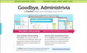
Freckle
Freckle is an online web application that lets you track your time. The site opens with an introduction to Freckle. It has a banner image that contains screenshots of the application. This image gives you a quick overview of what you will get when you use this app. If you want to take a tour of the app, they provide you with three different links to the video tour. The color scheme complements the content and helps guide you to the information that you need.
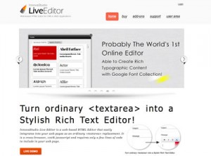
InnovaStudio LiveEditor
InnovaStudio LiveEditor is an web-based HTML editor that you can include in your CMS and web applications. Their website uses an image rotator to show why you will like this app. If you want to see the app, you can choose to try out a live demo or a video demo. The bottom of the page includes screenshots of the app. They use a minimal design which helps you focus on the app and not figuring out how to use the site.
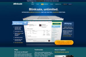
Blinksale
Blinksale is an online invoicing web application. Their website has a screenshot that shows the application and lists what you get when you use this app. Instead of a video tour, they use FAQs and Testimonials to help you decide if this app is right for you. The color scheme helps you to focus on the different sections of the page.
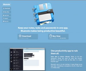
Bluenote
Bluenote is an app that allows you to store notes, passwords and tasks in one app. Their website rotates through the screenshots of the app in two different sections of the page. It also includes rotating testimonials from people who have used the app. Bluenote uses a blue color scheme on the website and app. The contrasting blues and white text make the site easy to read and organize the page.
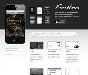
FieldNotes
FieldNotes is mobile app that allows you to take notes while on the go. You can take photos and record voice notes, video and your location. FieldNotes uses a black, white, gray and blue color palette. They use two different colored backgrounds to help you focus on the purpose of each section; top is for showing the app and the bottom is for describing it in detail. FieldNotes rotates screenshots of the app inside an iPhone. They provide reviews, a demo video and FAQs. FieldNotes provides you with enough information to help you decide whether or not you want to try the app.
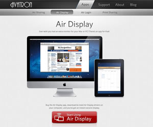
Air Display
Air Display is an app that can turn your iOS device into a a second display. It does this by installing the app on your iOS device and drivers on your computer. The website uses a black, white, and gray color palette. On the Air Display page, they use the color red to make the buy button stand out. The main focus of the site is to rotate through screenshots of the app on a monitor and iOS device. Below the app demo and buy button is the section that describes what you can do with Air Display and lists some uses and driver plus app compatibility.
Milwaukee Web414 Meetup had a CMS showdown. 6 CMSes were chosen to show why web developers should consider using them over their current CMS favorite. The CMSes represented were: MODx, WordPress, Sitecore, Drupal, Joomla and Concrete 5.
Why MODx?
MODx is fast, clean and well organized. It is easy for your clients to use. For developers, you have complete freedom to design and develop your sites. You can build a website or application fast with a minimal amount of code. When you need help, MODx has a great developer community and staff that you can rely on.
Why WordPress?
WordPress is easy to use. About 17% of websites use WordPress. You can easily teach your clients how to use WordPress. It has plug-ins and themes that allow you to extend and modify WordPress to fit your client’s needs. WordPress has a large and dedicated developer and user community that can help you when you have a problem.
Why Sitecore?
Sitecore is designed for mid-market and enterprise businesses. It is built on ASP.Net which is created and maintained by Microsoft; the others are based on PHP. Sitecore uses open source code, but is a closed source product. Larger companies like having a company that builds this type of CMS that way they know who to talk to when they have issues or requests.
Why Drupal?
Drupal has a flexible user interface which makes it easy to customize. It has an API that is customizable. With Drupal, you can specify permissions at the field level. You can use this to control who can edit a certain field. Roles are integrated everywhere. Drupal has a strong and talented developer community.
Why Joomla?
Joomla is 100% community driven. About 3% of websites are built on Joomla. It has about 6000 extensions, supports multiple languages and responsive design. Bootstrap is a part of Joomla. You can use tools like jQuery, MooTools and LESS with Joomla. Joomla also has a robust developer community.
Why Concrete 5?
Concrete 5 is easy to use. It has robust roles and permissions. You can connect to different back-ends easily. Concrete 5 is SEO-friendly and has desktop and mobile themes that you can use.
Which one?
The panel of presenters agreed that every project and client is different. They each have different needs. You need to choose the right tool for your project and customers.
What do Marco Polo, Zen Garden and Responsive Design have in common? Not much. The following are a collection of articles for inspiring you to share your story and responsive designs. Plus learn a few techniques for adopting mobile first design philosophy.
Learn from Marco Polo
Marco Polo is remembered as an explorer. Why? He wrote about his travels as a merchant. Writing is one method to share and to teach others what you know. Web designers and developers who write and teach can build an audience. If you want to be successful, start sharing.
Zen Garden
Happy 10th Anniversary to Zen Garden. Zen Garden was a great idea on how to showcase what is possible with CSS. It was fun to look at the new designs for inspiration and to see who was brave enough to share their ideas. They’ve reopened Zen Garden and want people to share their Responsive Designs.
Mobile Design Reasons and Techniques
More mobile devices are sold than babies are born everyday. People use their mobile devices at home, at work and on the go. Having a site that just works no matter the device is becoming more and and more important. If you need to convince your clients, here are 3 Reasons for adopting a Mobile First Design Philosophy.
Content has always been important. Most design techniques start with the look of a website and then add the content in later. Kayla Night explains how to focus on the content and design a site to complement it. Photos, graphics and fonts should help your audience read and use your website not overwhelm them.
How do you focus on designing a website that achieves your goals? By using whiteboards, visions and banned words, before you jump into wire framing or prototyping. Banning words like nice, most and clean help you to focus on the specific problem you want to solve. It prevents you from focusing on issues that don’t really matter. Will Dayble’s process can help you to focus your client on designing for the right problem.

 Responsive Design focuses on building websites that work on different devices. Your web designs should look good no matter what device your user is using. Responsive design requires changing how you build websites. There are many techniques for developing a responsive design. Tristan on Heliomblog suggests adopting a responsive web design process. This process emphasize content first. Web design works best when you have the content completed first. Then, use a mobile first strategy. It is easier to add on to a design for desktop users than it is to take things away for mobile.
 Why use Bootstrap? Bootstrap is a front-end framework. It uses CSS and JavaScript. Bootstrap is cross browser and cleans up CSS by using Normalize. CSS is built using