Thoughts on programming, web development and design.

Circuit Board

Category: CSS Page 4 of 10

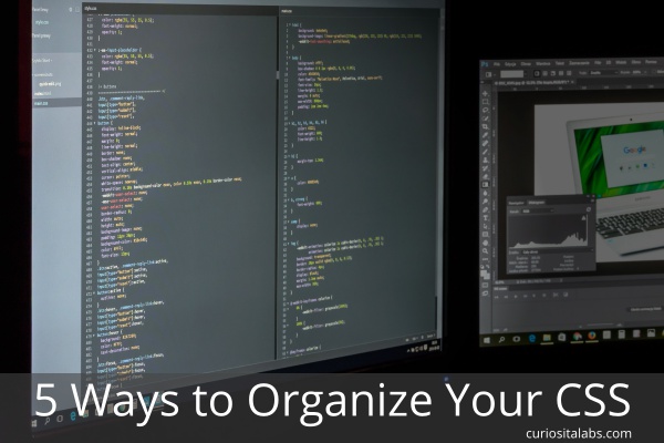
5 Ways to Organize Your CSS

How do you write and organize your CSS? Do you prefer to use a structured method or not? With CSS, you can choose to use an existing method or develop your own. Some CMSes like WordPress have their own styles. When you use them, you need to follow their rules and guidelines.

5 Ways to Organize Your CSS

Photo by Photo Mix from Pixabay

Your styles can get big, messy and convoluted over time. It can be hard to maintain. You don’t know what you can delete or change because you aren’t sure what problems it will cause. Without a method for organizing, it may get harder and harder to keep things straight. You can choose to use BEM, OOCSS, SMACSS, Atomic CSS or build your own.

BEM

BEM is a way of writing CSS created by Yandex. It is a very structured style of writing CSS. BEM has a component-based approach. This approach divides the user interface into separate components. BEM uses the structure of Block, Element and Modifier. It makes development easy and fast to update.

OOCSS

OOCSS (object-oriented CSS) applies principles of object-oriented languages to help you write CSS. It encourages code reuse and makes it easier to maintain. OOCSS uses the object-oriented principle of abstraction to make the code reusable. It helps you to separate visual elements like color, fonts and borders from the content. This separation makes your code easier to update. Especially when you need to change colors, fonts or other branding-related items.

SMACSS

SMACSS is more of a style guide than a CSS architecture. Scalable and Modular Architecture for CSS provides guidelines for writing CSS. This style guide helps you build CSS that is flexible and maintainable. With SMACSS, you create your own rules for writing CSS.

Atomic CSS

Atomic CSS focuses on small, single-purposed classes. You build well-structured HTML templates, so that your changes doesn’t break your design.

Your Own Style

When you build a website on your own or part of a small team, you can choose how you write your CSS. You may combine methods to help solve certain design problems.

How do you choose a method?

It depends. When you are working on your own project, you can choose which one you want to use. When you are working on a project that uses a CSS framework, it may be easier to use the method that the framework uses.

The best way to learn which one you like is to read the documentation and build a project with it. Then, you’ll know when to use these methods.

Add Simple CSS Animation to Your UI

When you create a web page, you use tools like fonts, colors, photos, illustrations and shapes to draw attention to important parts and guide the user on how to use your page. Another tool that you can add to help convey information is animation. Animation allows you to add movement or motion on your page. People are hardwired to respond and react to movement. By adding animation, we can use it as another technique for communicating with our users.

Add Simple CSS Animation to Your UI

Photo by: Image by Ambady Sasi from Pixabay

Why use animation?

Animation helps you to draw people’s attention the part of the page that has changed, show users where to look next or highlight the arrival or removal of important information. You can use it for telling a story, branding and improving your user’s experience.

What do you need to remember when adding animation?

  • Don’t animate everything. Use it sparingly. Animation should help guide people on using your page not distract or confuse them.
  • Make sure it fits with your style or brand. If you are playful and not serious, you can use animation that has a playful aspect. If you are more serious, you want your animation to be simple and functional.
  • Don’t assume that your animation will work on all devices. You need to test, test and test again.

What kind of animations can I use?

You can add animations to a dashboard, web app or mobile only features. One popular method is to change the hamburger menu to an X. This change lets the user know that the menu can be closed. You can add animations to images on hover or in a gallery.

Hamburger Menu changes to an X

See the Pen
Animated – Hamburger Icon (spans)
by Steven Roberts (@matchboxhero)
on CodePen.

CSS Animation on Hover

See the Pen
Playing a CSS animation on hover
by Val Head (@valhead)
on CodePen.

Accordian Image Gallery

See the Pen
Accordion Image Gallery
by Stefan C. (@stefcharle)
on CodePen.

How can I learn more about animation?

CSS Animation Rocks
A CSS Animations Tutorial
CSS Tricks – Animation
Create Cool UI Animations in CSS

Variable Fonts on the Web

Variable fonts is an OpenType font specification that puts different variations of a typeface into one single file instead of multiple font files for every variation that you may need. With a standard font, your visitors have to download multiple files which leads to more HTTP requests and data to their browsers. With a variable font, the file size may be about the same but you’ll have access to a much wider range of styles than currently available. For example, a font like Roboto has twelve font files which includes twelve variants. The variable font has one file and unlimited variants.

Variable Fonts on the Web

Photo By: Maret Hosemann

Can I Use It?

Not all browsers and operating systems support variable fonts. For example, Linux OSes need to download the latest Linux Freetype version and Macs need to use a Mac High Sierra (10.14) and Mojave.

For non-supporting browsers, you can use CSS Feature Queries to determine if it should load a standard font instead.

Why use Variable Fonts?

You can use a single font file that provides you with a wide range of widths, weights, slants and more. With less font files to download, your visitors don’t have as much to download. With a variable font, you have greater flexibility on how your text displays. You can use a wider variety of font variants to create certain affects that help define your style and voice. With most major browsers supporting this font type, you can start to use them in your next project.

Where can I see Variable Fonts in action?

You can try them out on v-fonts and Axis-Praxis.

Where can I learn more?

Prototype a website with CSS Grid

When I build a prototype, I start with pen and paper. A paper prototype (blog Post) helps me to develop my ideas better. What if your drawings don’t get the ideas across to your team or client? What do you do then?

You could use a prototyping app or start building in the browser. Sometimes, it is simpler to start building in the browser. With HTML, CSS and JavaScript, you can build it quickly.

Building Your Prototype in a Browser

When you create your prototype in the browser, use the basic tools for building the web–HTML and CSS. HTML and CSS let your build and make changes to your prototype quickly. You and your designers can focus on designing and testing finicky UI components like tables and drop downs.

What if HTML and CSS isn’t enough to get you started quickly? You want to build a prototype not focus on the layout. A framework like Bootstrap or CSS Grid can help you get started quickly.

Why CSS Grid?

You can build your prototype using other frameworks like Bootstrap. CSS Grid gives you more flexibility, simpler markup and no 12 column limitation. When you use a framework like Bootstrap, it can look as though it was built using that framework. If you need more flexibility in your branding and design, then Bootstrap won’t work for you. CSS Grid gives you more creative control.

How Do You Start?

With CSS Grid, you have three choices:

  • Start with a page layout example. With these experiments, you can learn how CSS Grid works without having to build all of the markup yourself. One of the examples uses the Skeleton Framework. I used this example to build a public domain book website with it.
  • CSS Grid Layout Builder, an app, you download to help you build your CSS Grid layout quickly.
  • Build a CSS Grid website by creating the markup yourself. Grid By Example is a good resource for learning how to build what you need with CSS Grid.

CSS Grid is another tool that you can use to build prototypes quickly. Layout templates, grid builders and online examples all can help you to create your prototype quickly so you can focus on the user experience and not the tools to build it. When building a prototype, the best tools are the ones that you use.

Build a Website With CSS Grid Starter Template

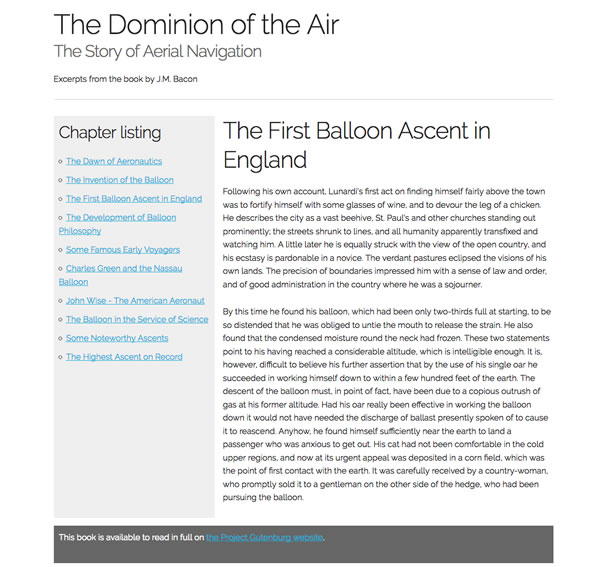
The best way to learn a new coding technique or design framework is to build something with it. I chose to build a website with CSS Grid. I wanted to take a book and make it a website. On Grid By Example, you can find a CSS Grid starter template that makes it simple to begin. The template has a simple two column layout: left-hand sidebar and right hand column for content. Plus, it uses an existing CSS Framework called Skeleton. I have used Skeleton to create WordPress themes.

Build website with CSS Grid Starter Template

What steps were needed to build the website?

  1. Choose and download a public domain book from Project Gutenberg
  2. Download the CSS Grid Starter Template
  3. Step up the new website with the CSS Grid Starter Template
  4. Modify the sample page with content from the ebook
  5. Create new CSS classes and modify existing ones to create the look I wanted
  6. Test and modify the CSS for mobile

Choose a public domain book for this project

You can download a public domain book from Project Gutenberg. I picked I chose Black Amazon of Mars by Leigh Brackett because I wanted to build a science fiction themed site.

Getting Started with the CSS Grid Starter Template

When you first install the template, your website looks like this:
Grid By Example Two Column Template with Skeleton

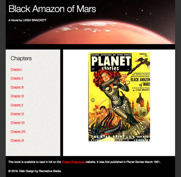
My next steps were to replace the template’s content with my own and start to add new CSS to start building a simple design. Then, I downloaded images from Pixabay.com for the website. I wanted a photo of Mars for the header and a better photo for one of the chapters. It had an illustration that didn’t go with the story. The final result looks like this.
CSS Grid Template with Black Amazon of Mars

Does it work on mobile?

CSS Grid is mobile-first. I had to make changes to the CSS for the additions that I added to the website. The CSS Grid part worked beautifully on mobile.

Summary

CSS Grid Starter template helped me to get started quickly. The template did most of the work. I didn’t have to figure out the layout from scratch. I spent most of my time creating the pages, adding the content and adding design elements to make the site look better. The starter template made my first attempt in building with CSS Grid simple and easy.

Page 4 of 10

Powered by WordPress & Theme by Anders Norén