What is a notification bar?
A notification bar is a horizontal bar that appears at the top or bottom of your website. You can display emergency messages or announcements to your visitors. Messages about closings, updates, news or sales offers.
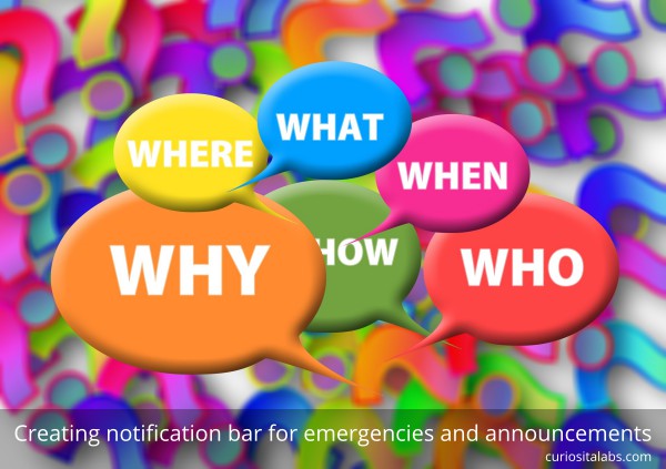
Image by Gerd Altmann from Pixabay
How can you add a notification bar to your website?
It depends on how you want to do it. If you like to write code, you can make it yourself with HTML and CSS. If not, you can add a plugin or a third-party tool to your website.
1. Make your own
Are you using Bootstrap? Bootstrap has alerts. You can create your own bar with Bootstrap alerts. If you are using a different CSS framework, you can write your own.
See the Pen
Alert Animation (feat. Material Icons by Google) by Ryan Young (@rcyou)
on CodePen.
2. Use a plugin to display message on your WordPress site
If you have a WordPress website, you may not want to edit your theme. Instead, you can add a plugin. WPBeginner explains how to use the plugins Optin Monster or Simple Notices for displaying important messages on your blog. If you are already using the plugin Advanced Custom Fields, you create custom emergency messages with it.
3. Use a third-party tool
You can choose to use a third-party tool like Getsitecontrol. They offer different ways of creating announcement bars for your website. You can add a sticky announcement bar or a slide-in banner that appears from the side.
Emergencies can occur at any time. You need to have a way of communicating with your customers and staff. Whether you make your own or use a tool, you can ensure that everyone can keep up to date on what is happening.