Thoughts on programming, web development and design.

Circuit Board

Category: Web Development Page 9 of 31

Making a Dark Mode For Your Website

Do you use dark themes or dark mode in your text editor? You can offer website visitors a choice of dark or light modes. Some people prefer using the dark mode because it is easier on their eyes.
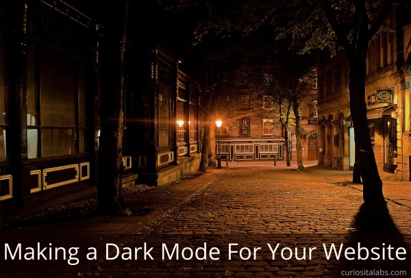
What do you need to create a dark mode?

The only tools you need are HTML, CSS and JavaScript. You can use a button to allow your visitors to select between modes or use media queries that check their operating system for their preference.

Toggle example

Ananay Negoi uses CSS Variables and a button to toggle between light and dark mode. She demonstrates how to build the Dark-Light mode switch.

Level 5 Media Query

Level 5 Media Query checks your operating system for your preference for a light or dark mode. You can use this query to automatically set the mode for each visitor.

Designing for dark mode

When you create a dark mode for your website, it involves more than switching the colors to darker ones. You need to consider how color, fonts, images affect the readability and usability of your website. Your website reflects your brand. You want to think about how a dark mode can affect your brand. Andy Clarke walks you through the steps he took when he created a dark mode version of his website.

Dark Mode Resources

If you want to implement a dark mode design of your website, refer to these resources on how to do it.

Animation Principles for Enhancing UX

With new tools like CSS Animation, JavaScript Libraries and modern browsers, we can easily add animation to our websites. Animation helps you to provide context, give feedback, convey status and delight your users. You can affect color, location, scale, shape, focus and opacity of objects. By learning the principles of animation, you can create deliberate animation that improves the user experience.

Photo by Aline Ponce from Pixabay

12 Principles of Animation

Disney animators, Ollie Johnston and Frank Thomas, first introduced the 12 Principles of Animation in their book, The Illusion of Life: Disney Animation. They examine the process of animation from Disney’s leading animations and provide you with 12 basic animation principles.

What do the 12 principles provide?

  • Realism
  • Context
  • Causality
  • Focus
  • Delight

They also help to create hierarchy and relationships between objects. These principles help you to provide feedback to the user, indicate status and give instructions. One of the first uses of animation on computer screens was the flashing cursor. It tells you that you can start typing and that the computer is working and not frozen. This simple animation conveys information faster than words can.

How to Use Animation Responsibly

When you are deciding to add animation to your user interface, consider the following:

  • Does it add value?
  • Are your behaviors consistent?
  • Is the user interface still functional without it?
  • Is the animation optimized?
  • Do you need it?

Using Animation to Enhance User Experience

At WordCamp Atlanta 2019, Michelle Schulp gave a talk Squash and Stretch and Good UX- Using Animation To Enhance User Experience. She gave a quick overview of the 12 Principles of Animation. Michelle explains the uses of animation and how to use animation responsibly.

More resources on animation

Get Data Using JavaScript Fetch API

I was looking for a simple to get data from an API. When I found this tutorial using JavaScript Fetch and the Random User API. You use Fetch to send a simple GET request to the Random User API and provides you with JSON data of 10 random people.

Get Data Using JS Fetch API

Photo by Shopify Partners from Burst

Why manually type in code?

In Learn Ruby: The Hard Way, Zed A. Shaw, explains that you must type in the exercises by hand. It helps you to learn how to read, write and see code. By using copy and paste, you don’t learn how the code works.

How do I used this tutorial

This site is simple. I started with a simple HTML site. Then, I made some adjustments after I got the GET request working.

1. Added style to the website
I started with a simple HTML website that didn’t have much style to it. First, I added CSS code to style the images. Then, I added a header and footer to the site. I decided to stick with a black and white color scheme.

2. Changed how the API displays the data
When I first created the site, the API returns the user’s name in all lower case letters. I wanted the name to follow the format of first letter upper case and the rest lowercase for both first and last name. I modified the JavaScript to capitalize the first letter.

function capitalizeFirstLetter(string) {
    return string.charAt(0).toUpperCase() + string.slice(1);
}

The API returns the email address as text only. I wrote an additional function to change email to be an actually email link.

function createEmailAddress(string) {
    return "<a href=mailto:" + string + ">" + string + "</>";
}

3. Changed the size of the photos
In the tutorial, the photos are on the small size. I wanted them to be bigger. To learn how to do that, I went to the Random User API documentation and read how to get bigger photos. It was a simple change.

Random User API

See more about learning JSON by building a simple website.

Using SVGs in Your Web Projects

Are you using SVGs in your web projects? Scalable vector graphics can be used as background patterns, icons, logos and illustrations. They look nice and sharp at all screen resolutions. SVGs can have a small file size which helps you to keep your website size smaller and work better.

Using Svgs in your web projects

Image by Gerd Altmann from Pixabay

How do I get started?

It depends. Are you planning on creating your own or using pre-made SVGs? If you want to create your own, check out SVG on the Web. It is a practical guide for creating and manipulating scalable vector graphics. CSS-Tricks walks you through creating a simple SVG and manipulating it using CSS in Using SVG.

Where can I get SVGs to use?

  • SVG For Backgrounds lets you customize and apply a selection of backgrounds.
  • HeroPatterns has a collection of svg background patterns that you can customize for your web projects.
  • HeroIcons creates scalable vector graphic icons that you can customize with CSS.

Add Animation to Your Scalable Vector Graphics

People react and respond to movement. You can animate svgs to draw attention to a specific area. Animate your graphics with CSS or JavaScript.

You can start with the basics and learn how to use CSS to animate your graphics.

Or you can use SVGator, an online tool, that helps you animate scalable vector graphics.

If you prefer JavaScript, you can use Snap.svg, a JavaScript library, for animating your vector graphics.

How do you choose the right font?

Fonts come in all kinds of styles. With so many to choose from, it can be hard for a developer to know where to start. Your brand and voice are identifiable by your colors, photos, other design elements as well as the fonts that you choose.

How do you choose the right font?

Photo by Florian Pircher from Pixabay

Use these following tips to help select that fonts that enhance your design.

1. What type of personality matches your brand’s tone?

Are you Traditional, Reliable or Respectable? If so, you want to choose traditional fonts like Butler, Georgia or Times New Roman.

How about Contemporary, Modern or Progressive? Try modern fonts like Simplifica, Raleway or Prime.

Or are you Strong, Bold or Stable? Strong fonts like Glamour, Code or Nexa might work for you.

Maybe you want to convey Elegance, Vintage or Romance. Try handwritten script fonts like Allura, Sofia or Pinyon Script.

If those don’t fit you, you may need a more custom or unique font. Stylish fonts like Butch or Moon may work for you.

2. Is the font easy to read?

Do you have to concentrate to read the words? If you are getting exhausted trying to reading the font, then your customers will too. You want them to be able to read without any effort.

3. Does it look good in different situations?

You want to choose a font that looks no matter what you do to it. When you bold or italicized it. It should be easy to read when large and small. Some fonts look better on top of photos. Your brand colors can affect how readable the font is.

4. Do the fonts look good together?

After you have chosen the type of fonts that convey your personality, you want to pair fonts that compliment each other. You’ll need to decide how your headlines, content and calls to action will look like. Pairing fonts can be challenging. You can learn the basics for choosing fonts that fit your personality.

You can use these additional resources for pairing fonts:

Where can I get fonts?

Page 9 of 31

Powered by WordPress & Theme by Anders Norén